Nexus
Portfolio management tools for game developers
Role
> Lead Product Designer
Timeline
> 8 Months
Skills Focus
> UX Research
> Product Strategy
> UX Design
> Design System

01 —
Business Goal
ProbablyMonsters was struggling to maintain a consistent development process and measurable output from teams. They were noticing stilted progress from multiple projects, wasting time and productivity long reviews with leadership. I was brought in to address this challenge in a single shared source of truth for both leaders and developers.
— 02
User Goal
Development teams have a lot on their plates and over the course of this work we learned that their priorities did not line up with executive leadership. Developers struggled to keep up with business needs and align with central engineering support while also maintaining vision and productivity on their project.


Approach
I knew from experience that enterprise tools have a high barrier to entry for small and medium sized companies. Existing tools like Jira and wikis can handle many of these functions, but in a clunky and frustrating way. But what these tools lack in user experience they often more than make up for in implementation cost.
For a custom system to pay off the time and resources to build it, the system needs to significantly outperform existing generic solutions.

To deliver those outcome, I focused on delivering economies of scale, providing faster and unified access to resources, and streamlineing workflows through automation. I began by mapping existing processes and building service blueprints, to find opportunities for efficiency and automation. But when I ran my first workshops with the dev teams, I hit a wall.
*

“There is no ‘How’ or ‘Why’ to this. I don’t understand how any of [the framework steps] lead to positive outcomes for my game”
- Game Producer

“So if we finish all that, do we have a game? Obviously not!”
- General Manager

“Artifacts are just a document for someone to check, not something [the teams] are working on to drive their game forward”
- Lead Engineer
Misalignment
When I moved to workshops with the dev teams leads, a new picture became clear. Each team had a different approach to their development journey. They did not believe the current framework supported their needs. Their feedback was candid and clear: the system produced artifacts, process, and meetings, but not meaningful outcomes.
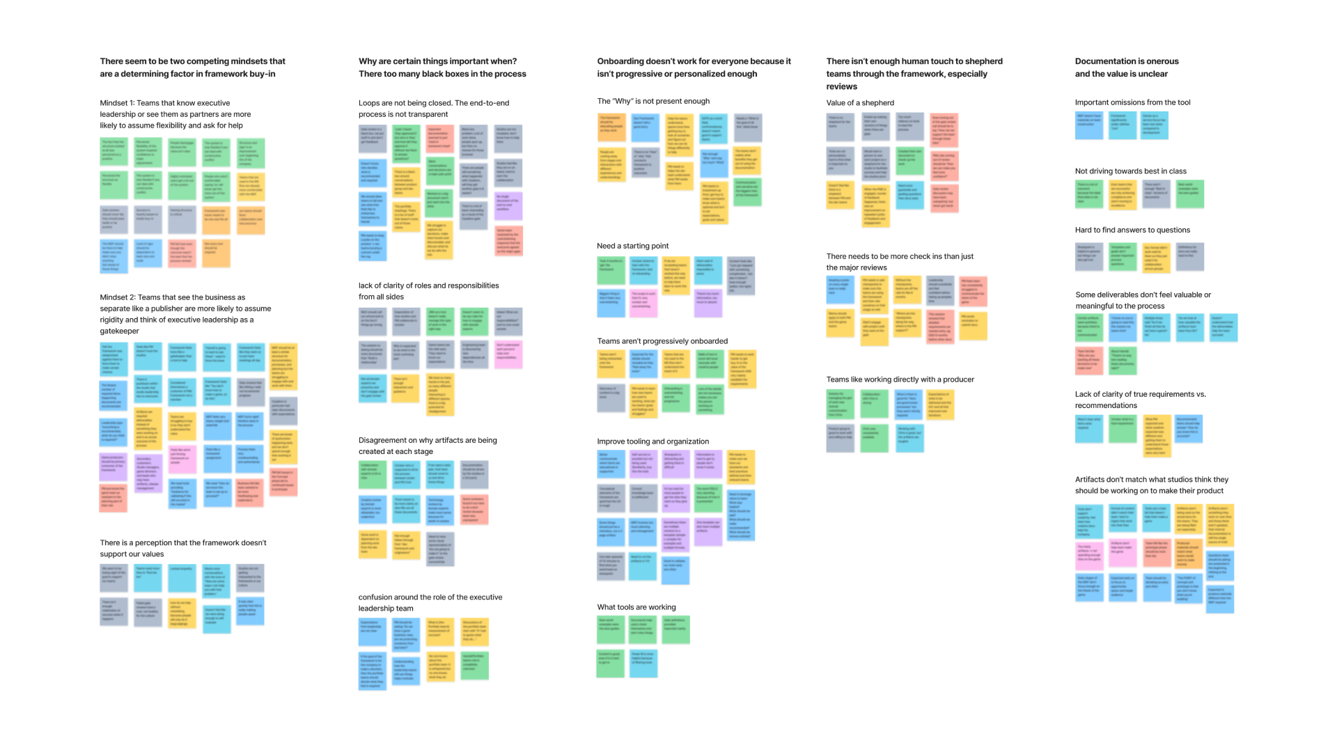
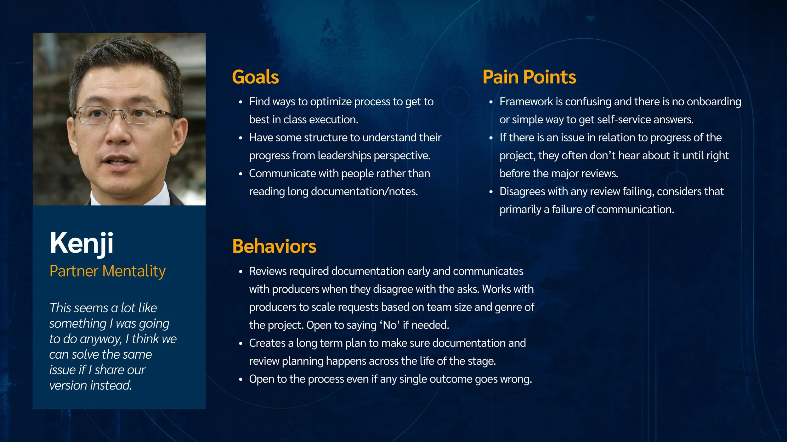

This was a record-scratch moment for the project. I realized we could not simply digitize a flawed process. Instead, we reframed our work to solve the developers’ problems first, then use the tool’s data to give leadership the visibility they needed.
Pivot
I ran interviews with studio heads and partnered with production experts to evolve the framework. Together we adapted the system with more meaningful touchpoints and fewer burdensome deliverables. Teams with the partner mentality immediately recognized the improvement and were eager to move forward. We opted to focus on two of these teams for an initial pilot.
How might we
Address the onerous documentation?
How might we
address the lack of ongoing support without additional resources?
How might we
Align leadership reviews to development outcomes?
I proposed that the best path forward was to prioritize the developers’ pain points first. If they bought in, then data from the enterprise tool would give leadership the visibility they needed.

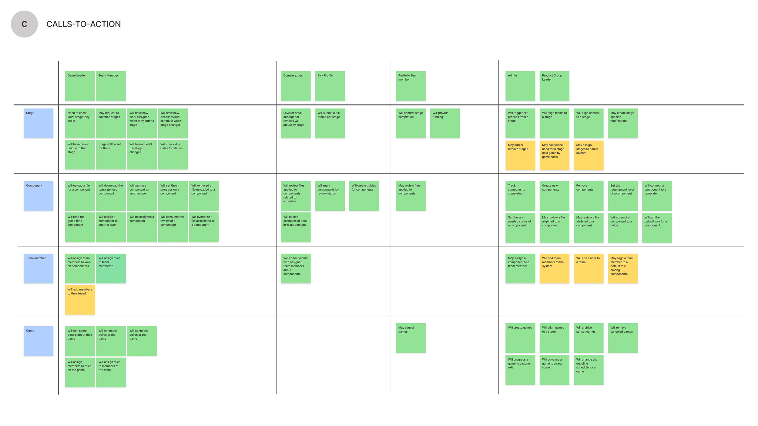
I performed an object-oriented design assessment to clarify the structure of data in this new system. This helped to map out the data flows of the framework so it was easier to design the UI for manipulating that data.
Design
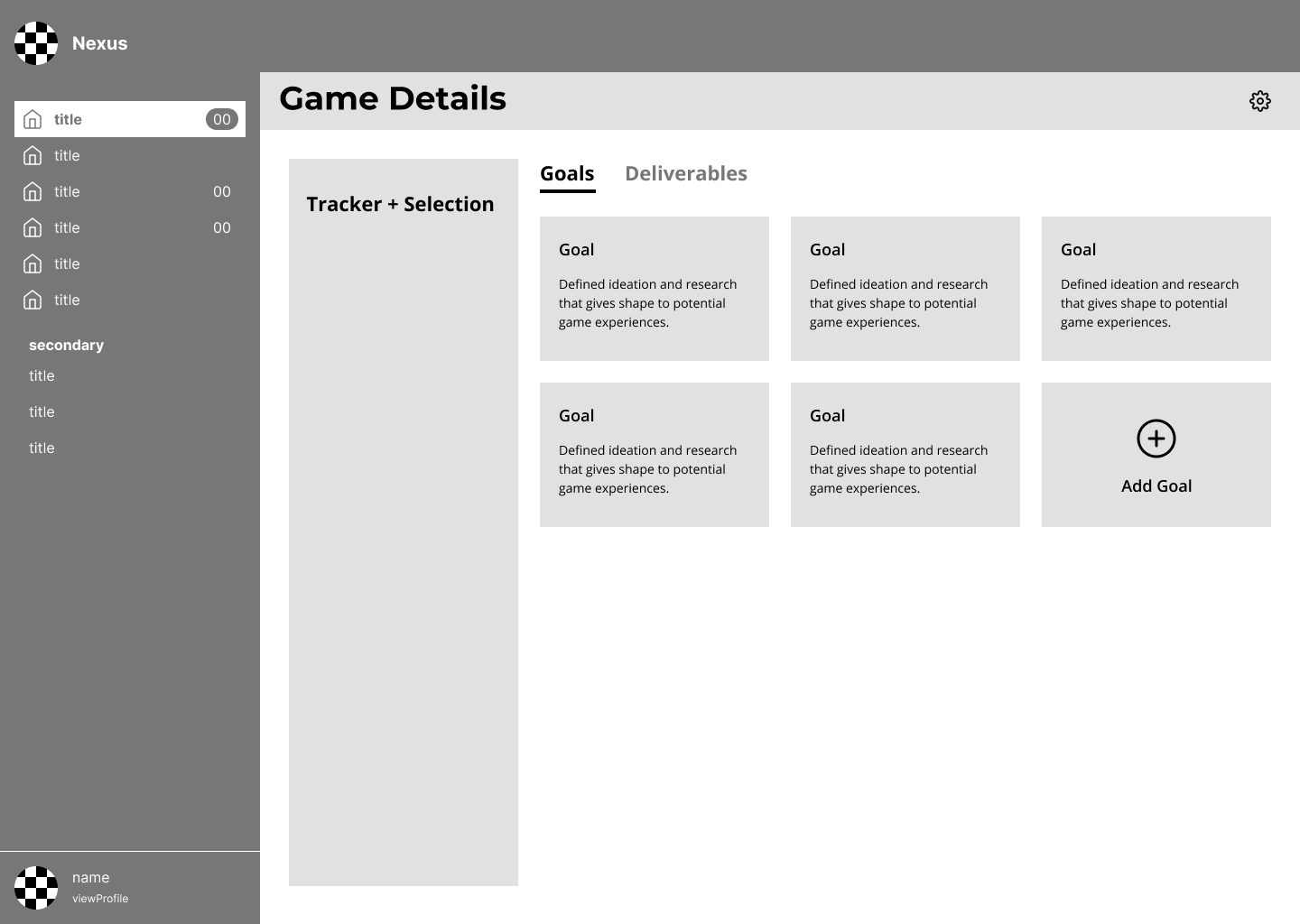
With buy-in secured, I shifted focus to the product itself. I facilitated a prioritization exercise to define what mattered most on each screen, always balancing leadership’s portfolio view with developers’ need to focus on their own projects.
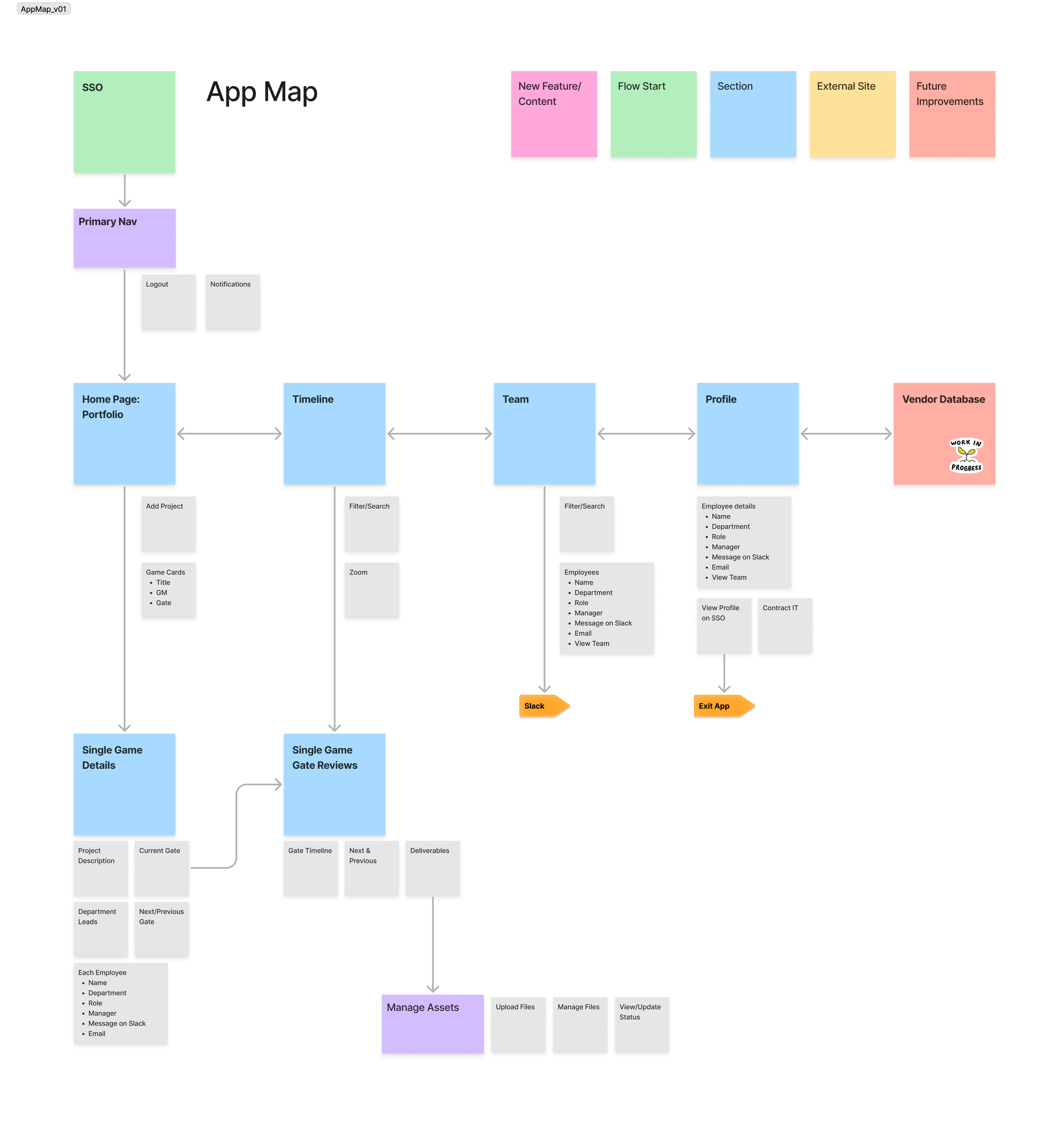


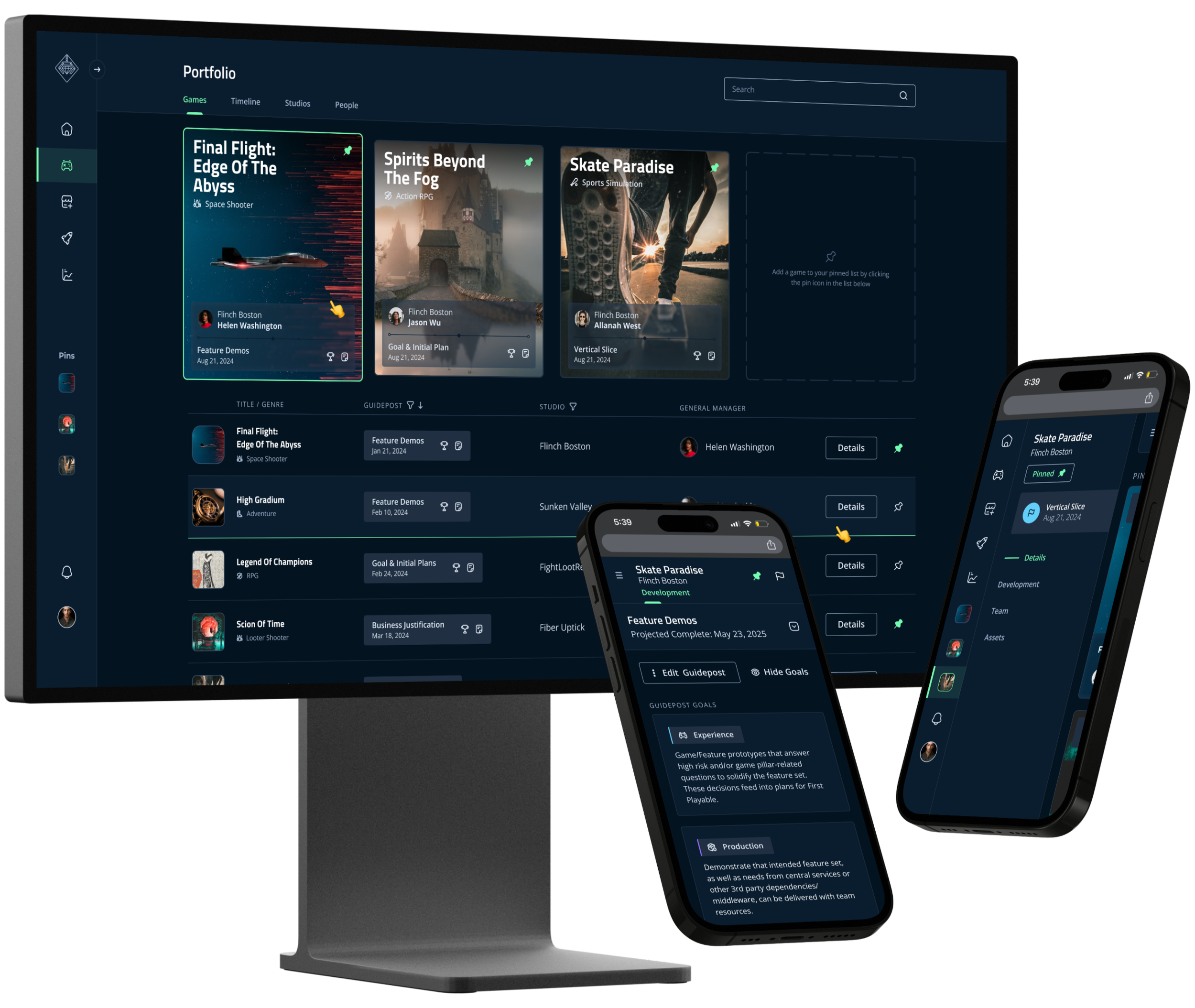
Early blocking exploration for aligning content visibility and interactions

Validation
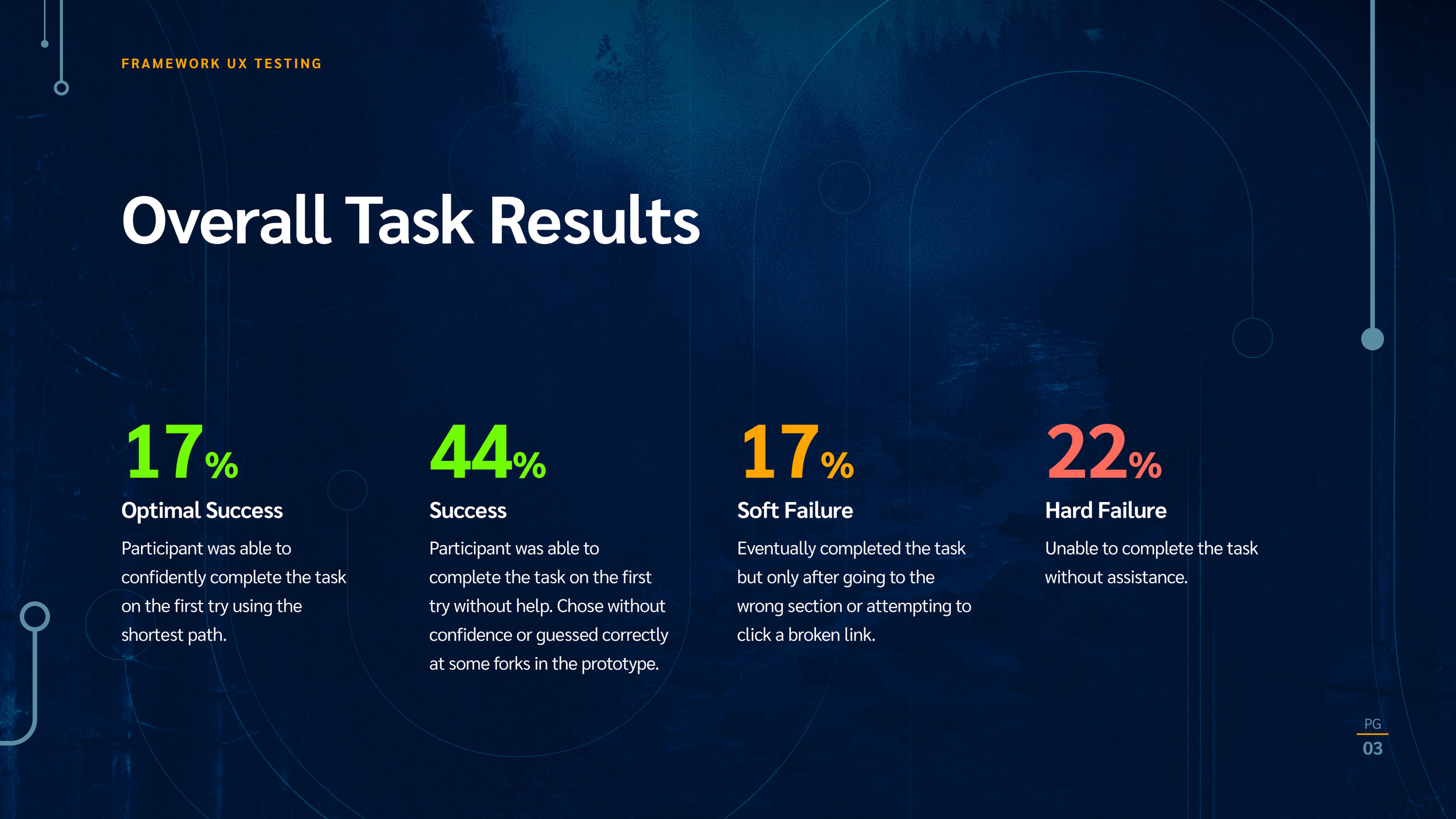
Using a clickable prototype from the wireframes, we ran six usability tests with both developers and central service teams. Usability was strong, but the feedback revealed a gap:
Developers needed more personalized navigation, Central services preferred the aggregated view.


Navigation Challenge
The accordions confused users. They expected to be able to visit the parent pages and find games. Users pointed out that their primary focus would be on their own project, leaving much of the existing navigation irrelevant.
Tracker Clumping
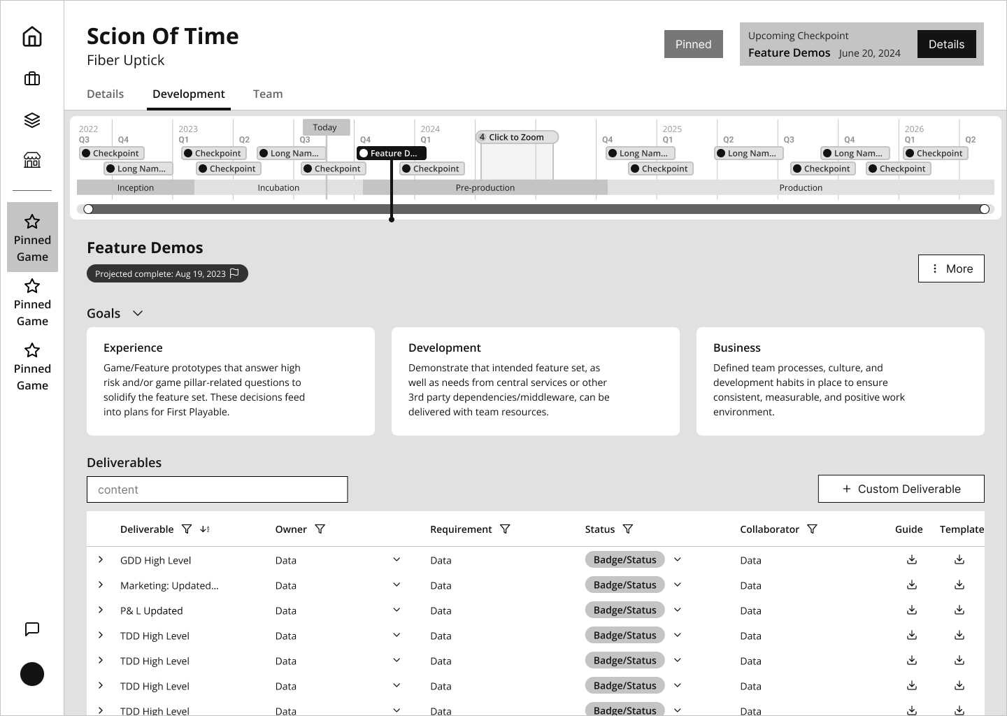
Our initial prototype only featured the default schedule for checkpoints. As a result, users would move dates so close together they would be indistinguishable and not be able to accurately select specific nodes.
Lack of Context
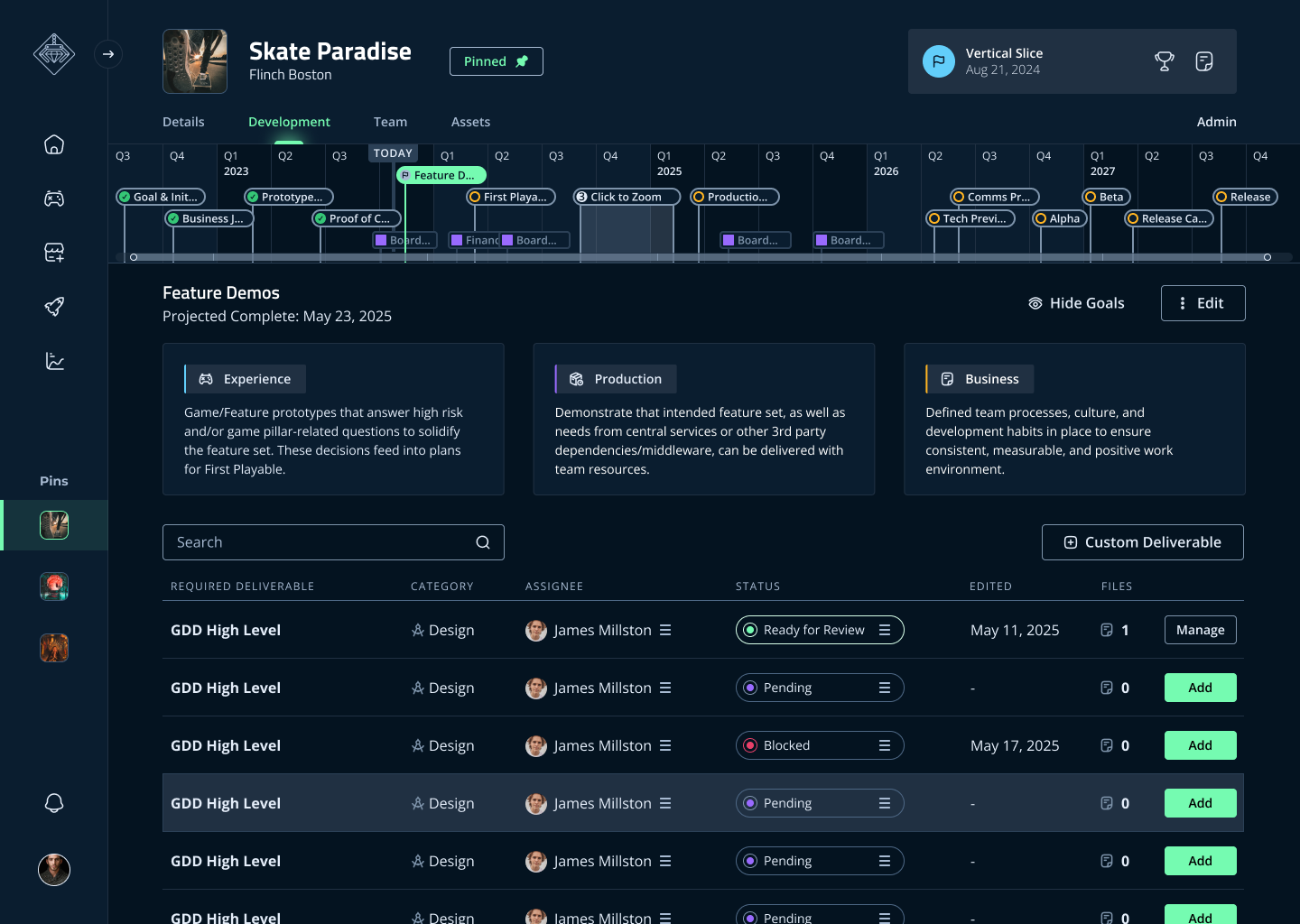
Testers appreciated the clarity of the timeline view, but also wanted to see key dates for the company. Milestones like quarterly financial timelines, all-hands, board meetings, and company play-tests helped teams contextualize their goals.
Not Responsive
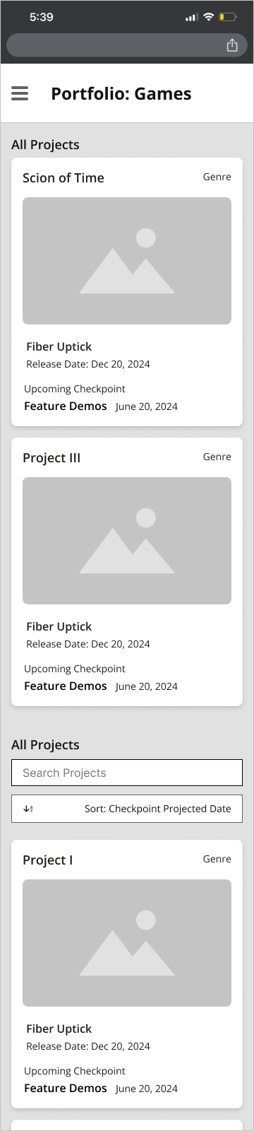
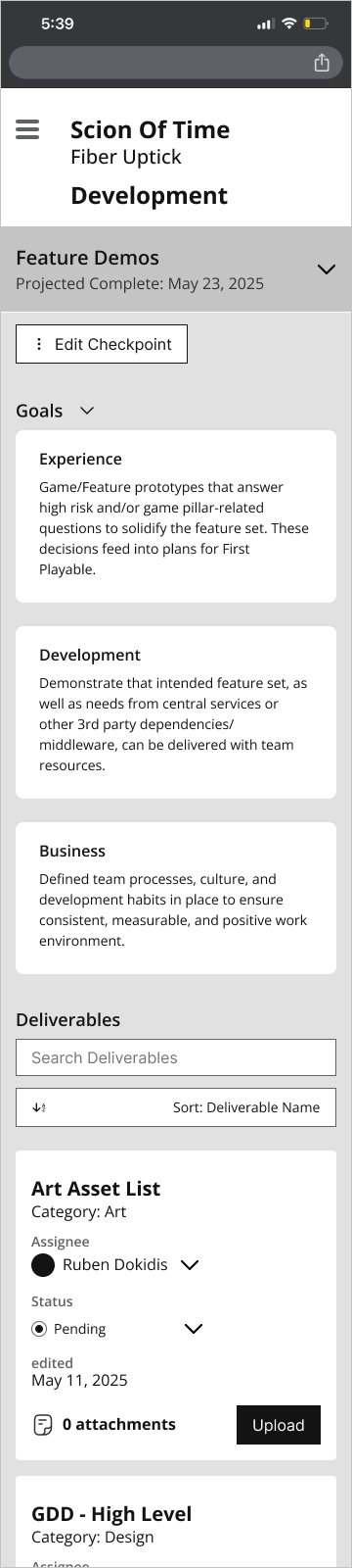
Executives wanted a responsive app for mobile viewing to quickly check the status of projects to prepare for 1:1s and meetings with partners.
Addressing the Feedback
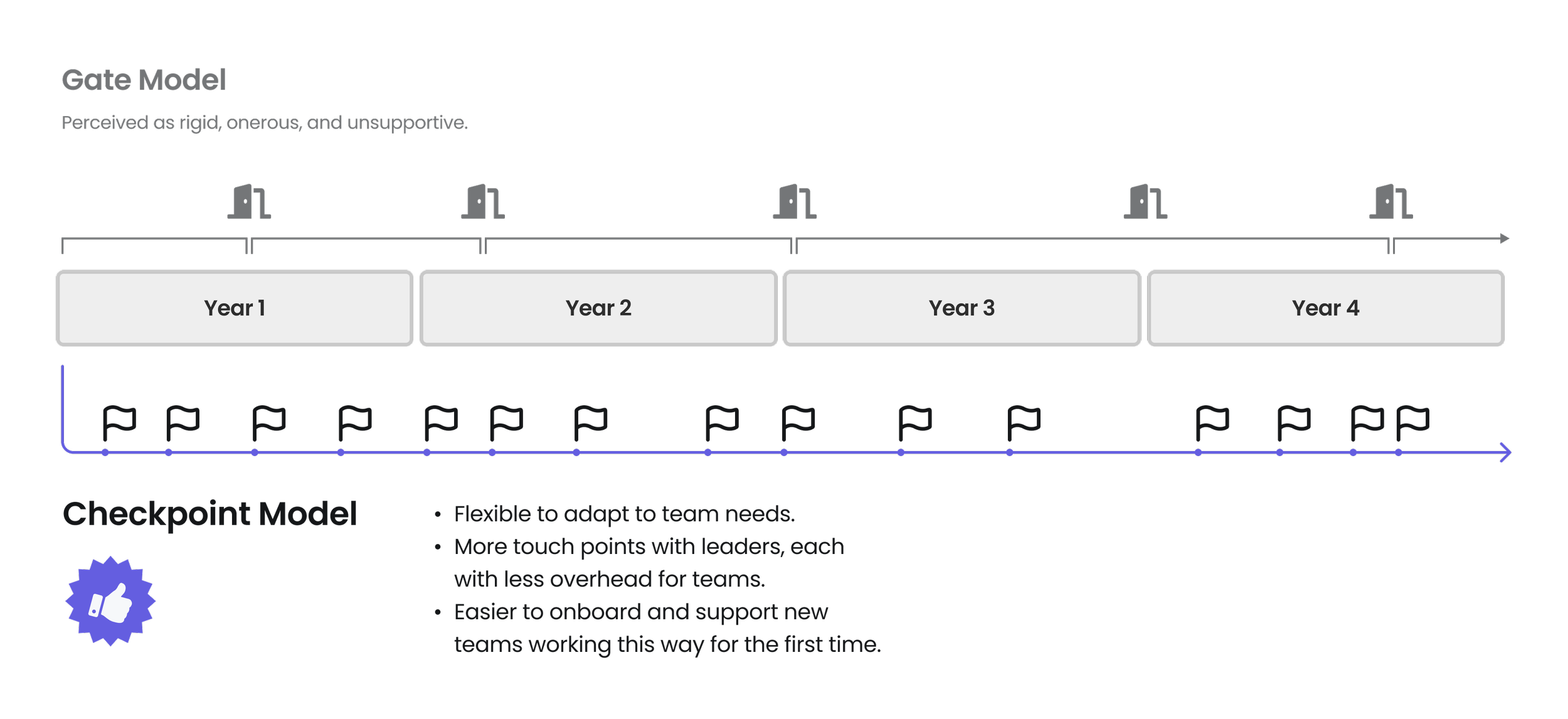
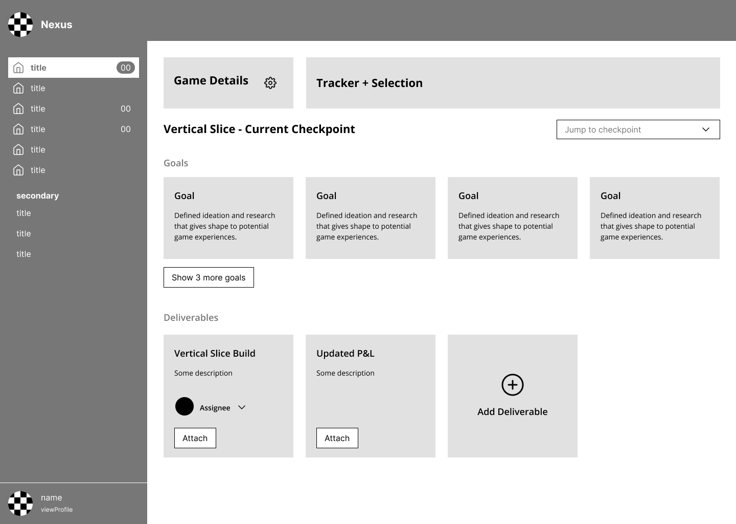
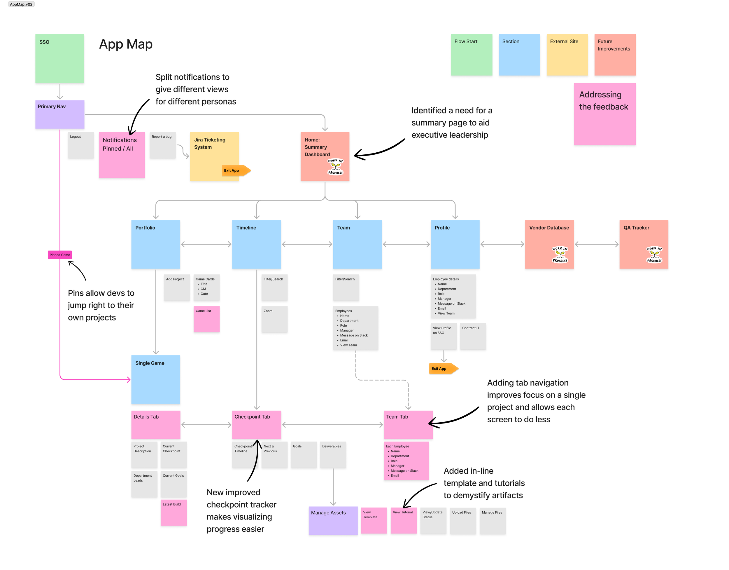
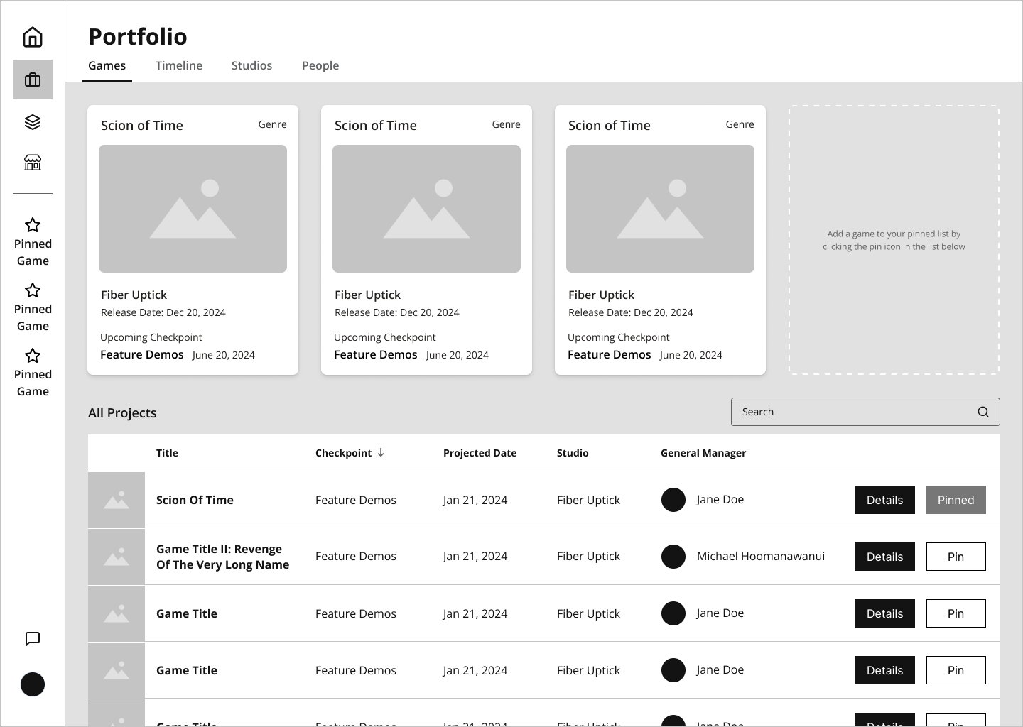
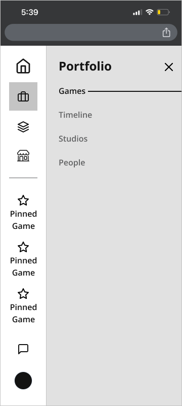
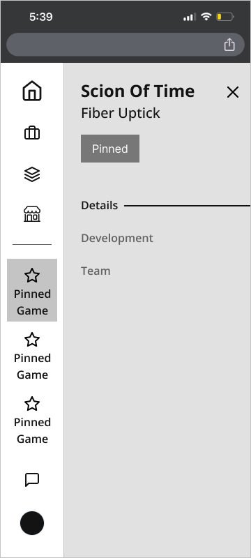
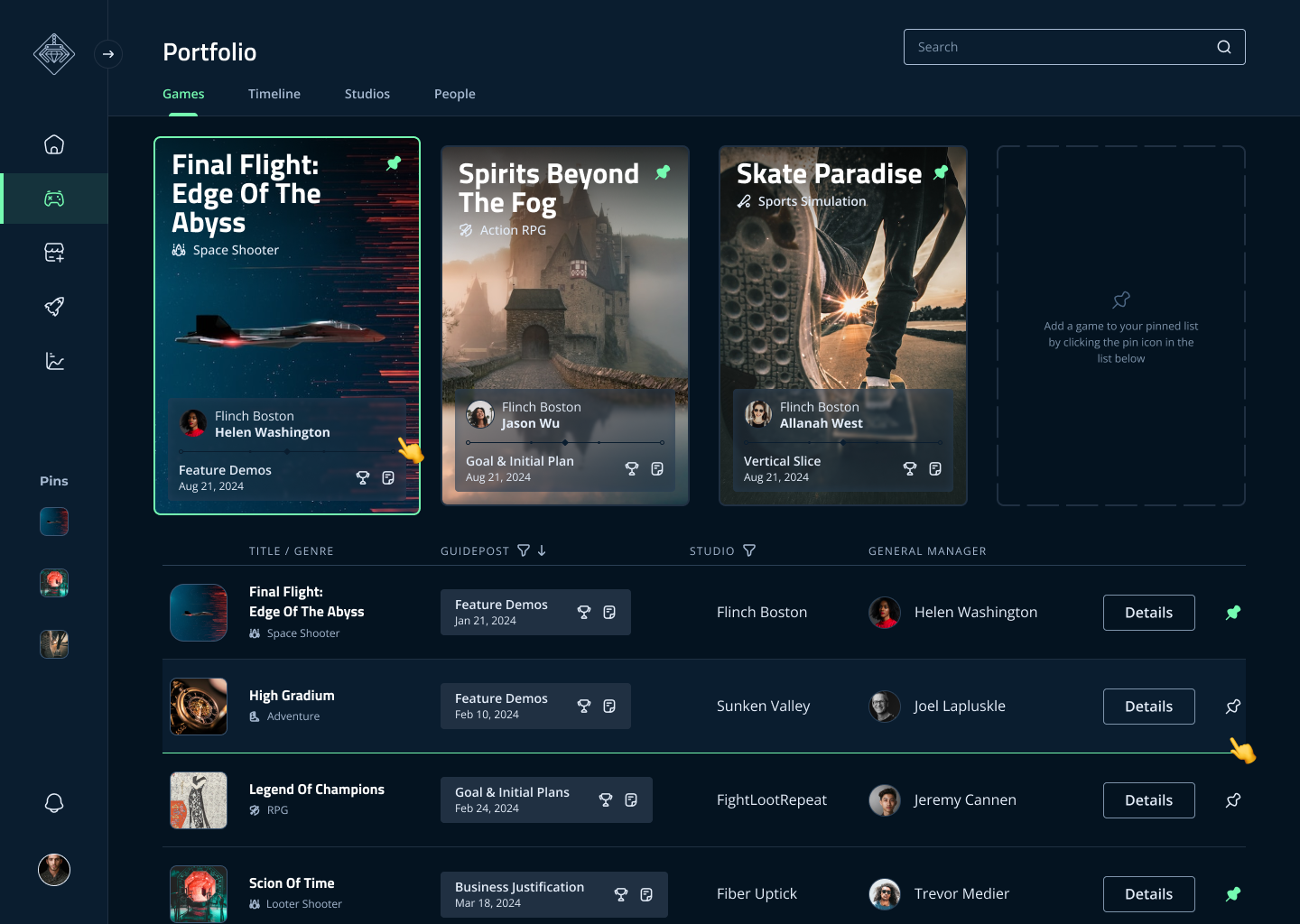
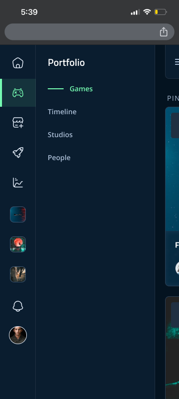
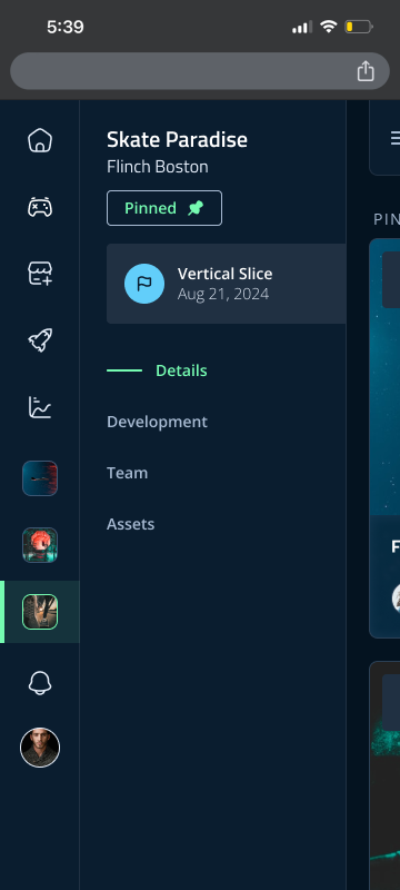
This feedback made me rethink some of the information architecture and navigation. I realized there needed to be more clear hierarchies between Company / Team / Project / Checkpoint. This change allowed the user to understand where they were in the system. I also introduced pinning, which let teams spotlight the projects most important to them, and created an alert system so leaders could see where attention was needed most.
To prevent tedious setup, the app would pin any project to which a user’s login was already associated. This way, new hires or one off delegates could take advantage of the feature from the first login, securing additional buy-in from previous skeptics.
Retesting with these changes was well received and we moved into high fidelity for further refinement.
Users needed clarity of hierarchy between Company / Team / Project / Checkpoint.
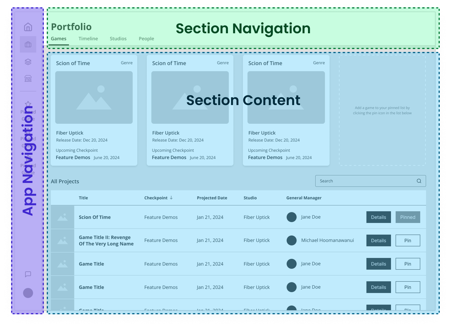
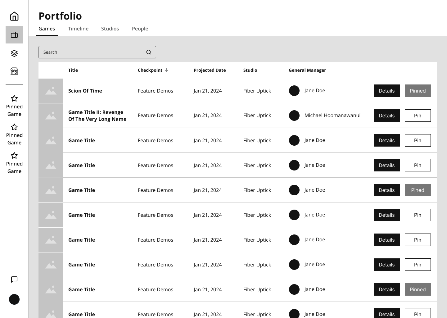
New Feature: Pinning
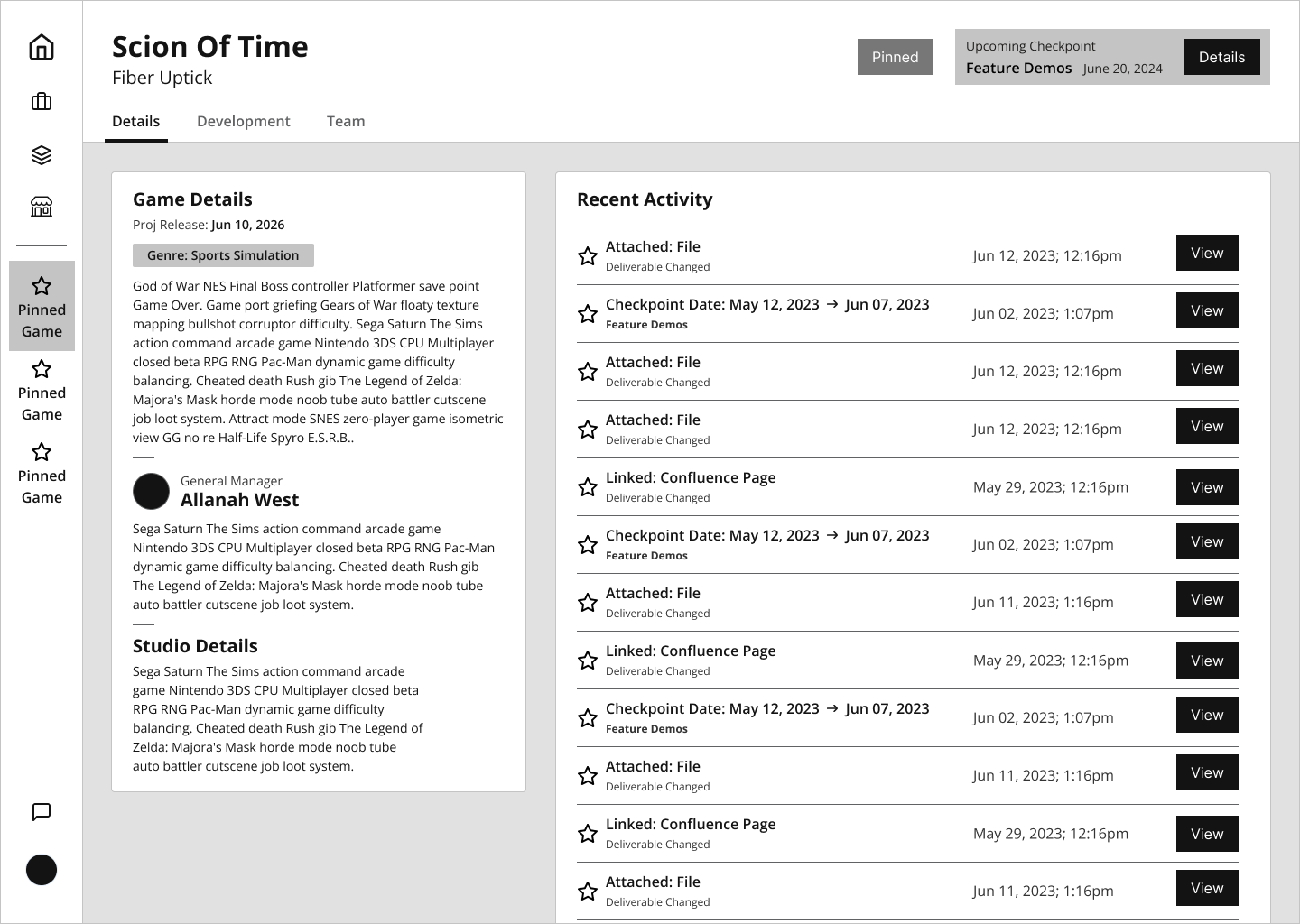
In this iteration, I included a new feature called "pinning” aimed at power users. Users could pin up to three projects in their side nav. This gave Devs the focus they requested, but also let Central Services swap focus to whichever projects were approaching a deadline.
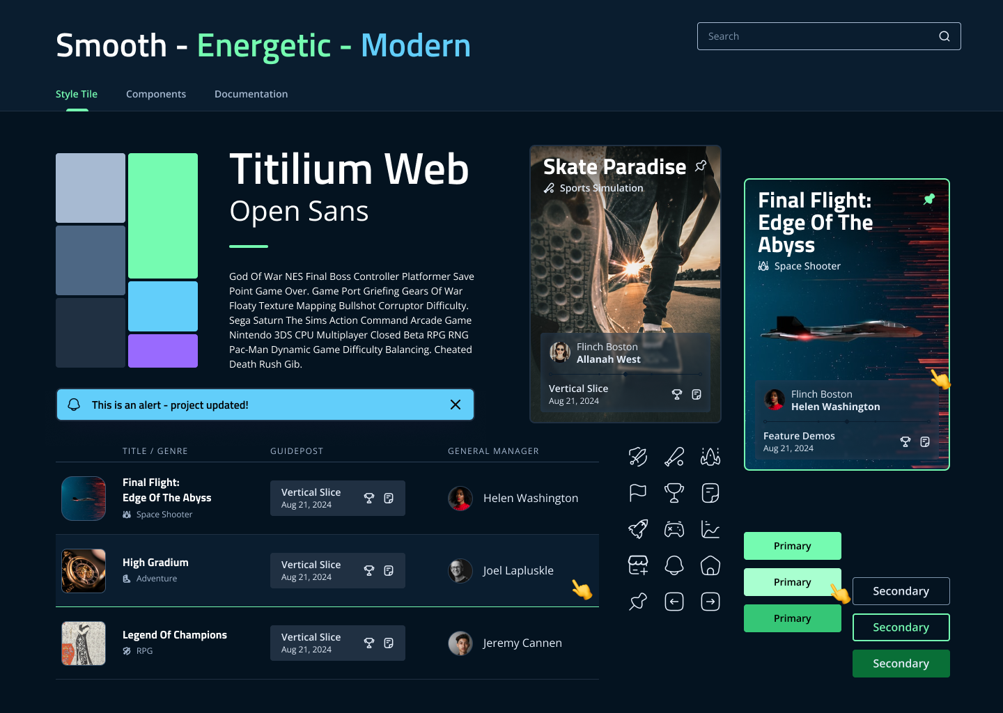
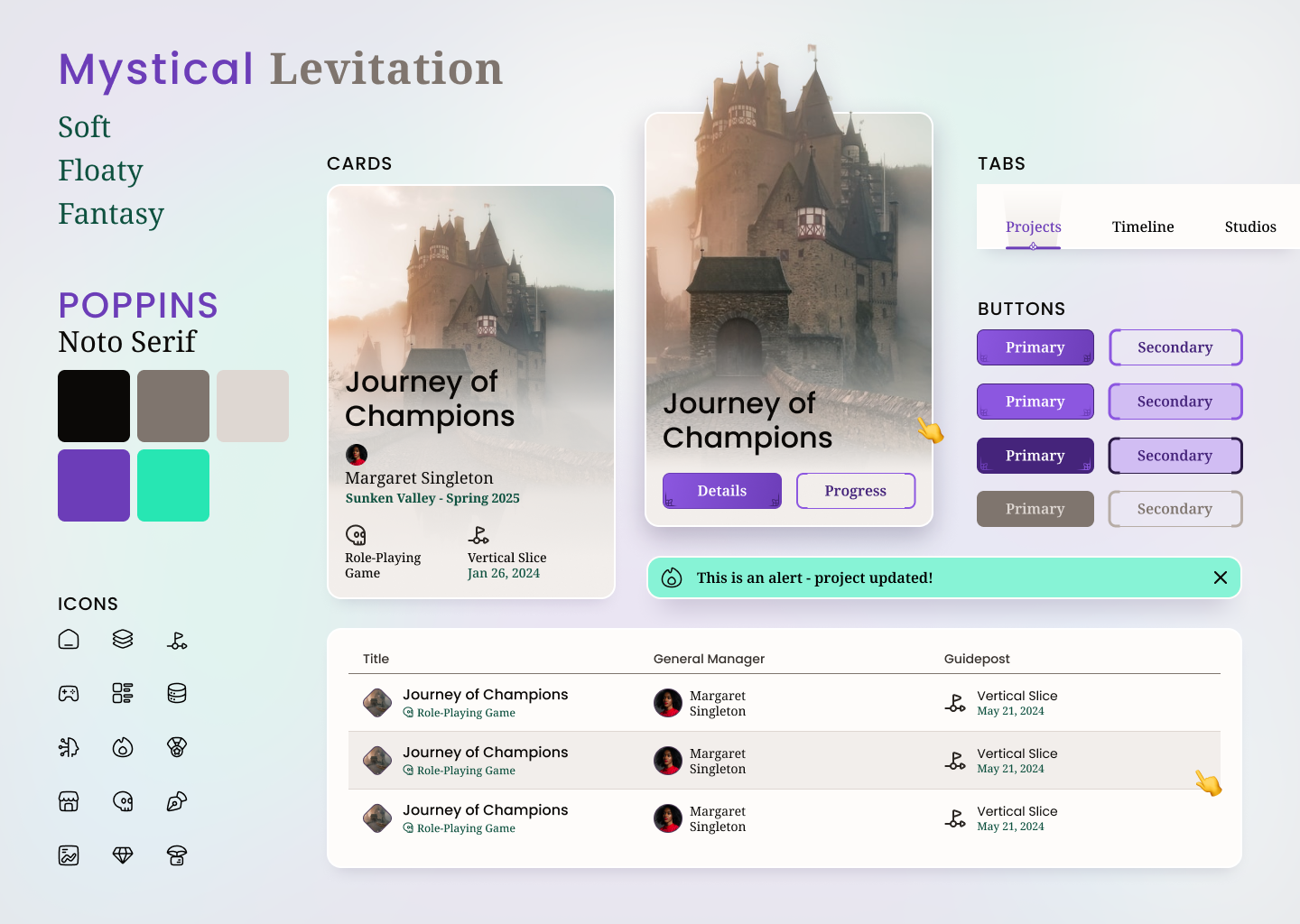
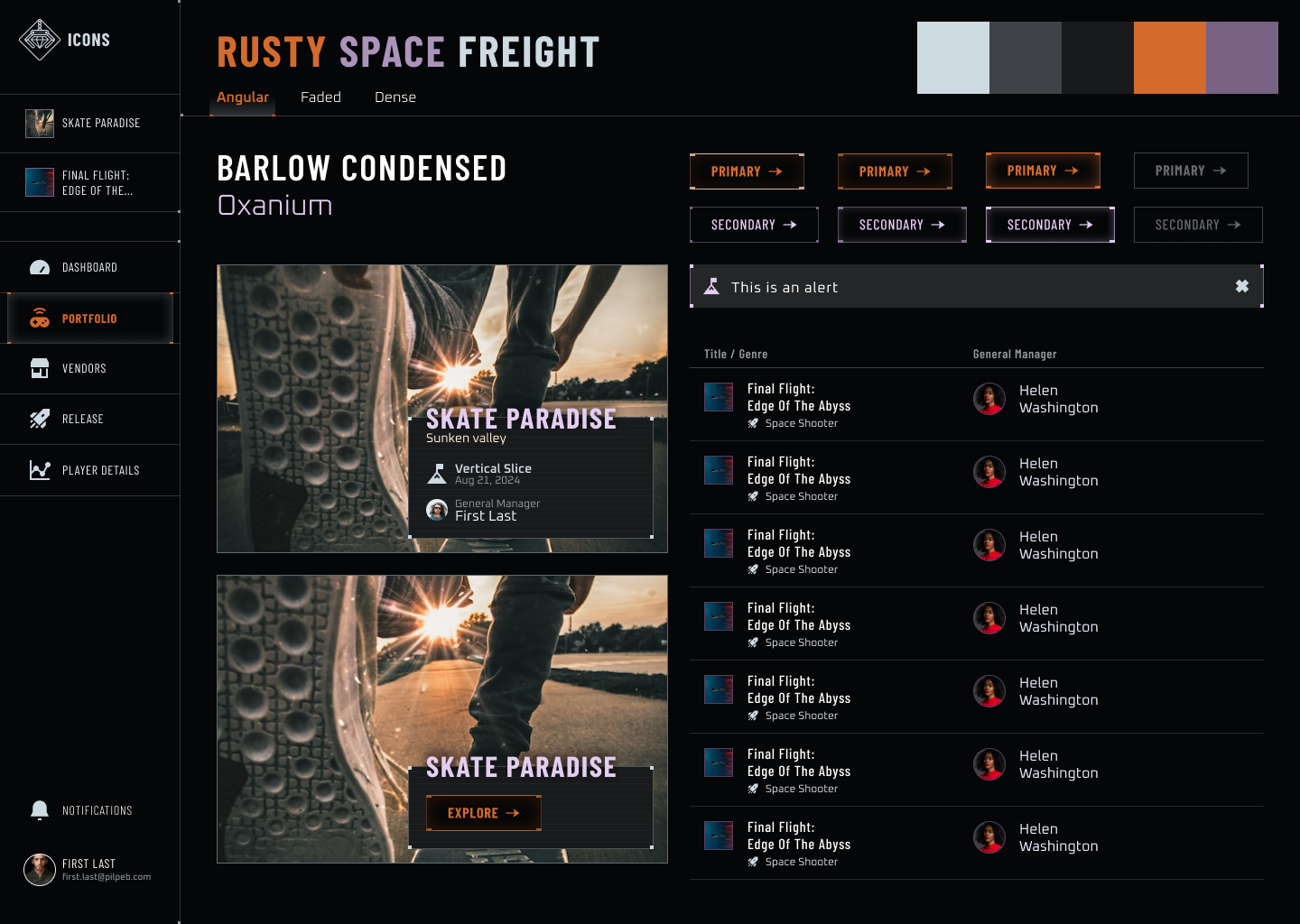
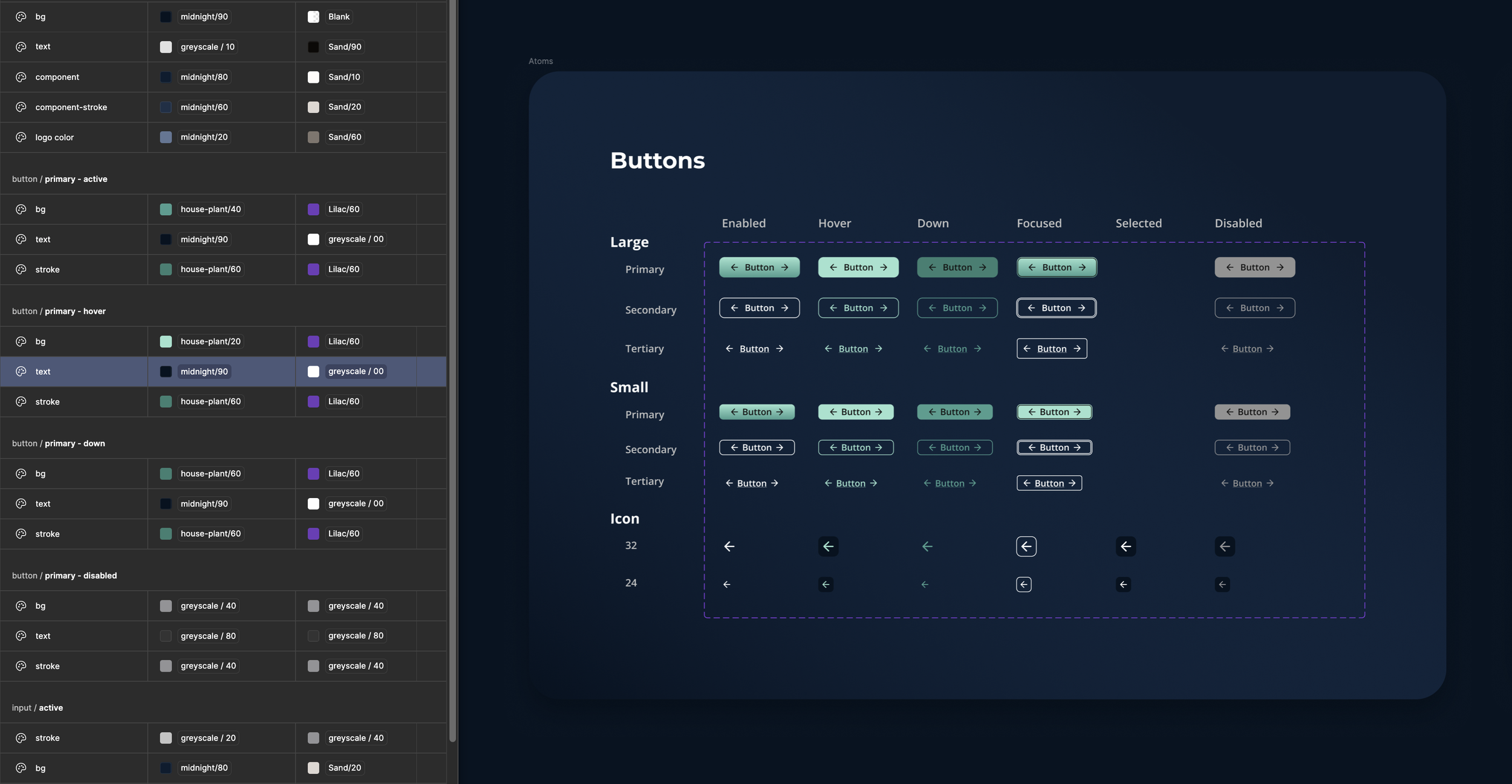
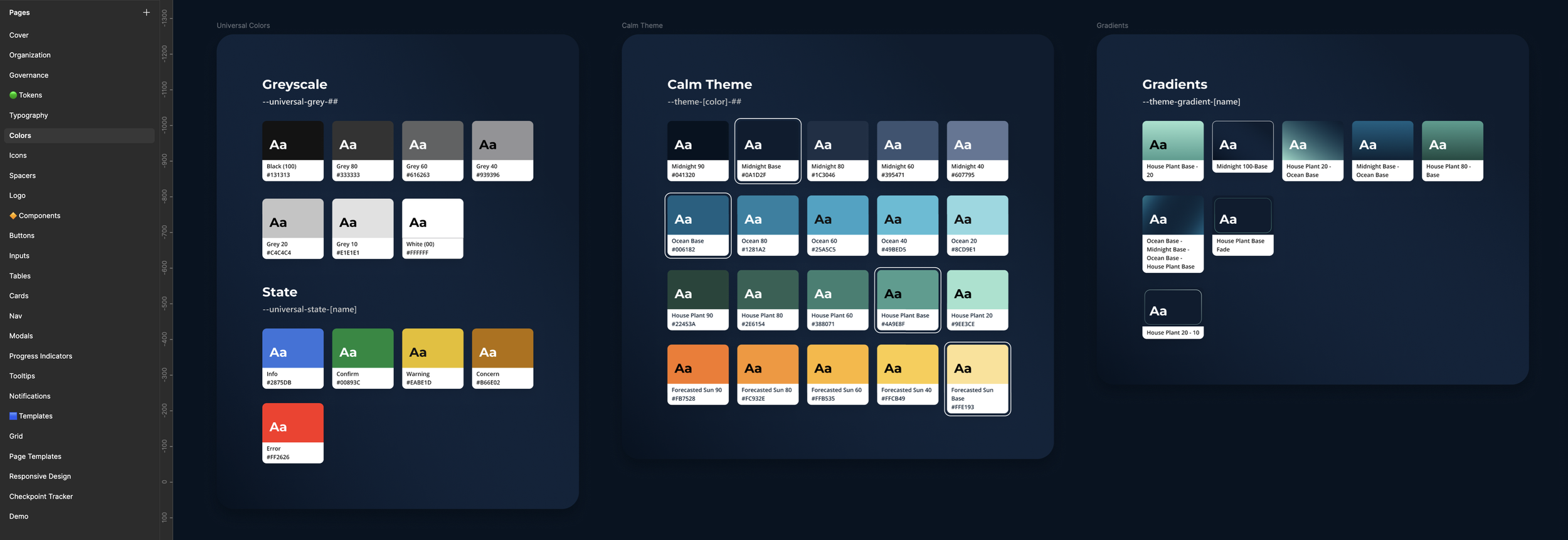
Design System
I collaborated with a visual designer to craft a theme that could stand on its own, since the company brand was still evolving. Knowing this tool might one day serve other companies, I created a design system in Figma with tokenized colors and typography, making it easy to reskin for future partners. This system gave us the consistency and scalability we needed, and the joy of seeing the design come alive energized the team. It also established accessibility standards for contrast, keyboard and assistive tool compliance, and consistent use of ARIA labeling.
Shortly before rolling off this project I collaborated with one of the frontend developers on the project and started the process of building out the design system in Storybook.
Delivery
Working closely with a junior designer, we fleshed out the first iteration for development. We prioritized the most common flows, integrated SSO for a frictionless first login, and added in-context tooltips for new users.
I collaborated with a small dev team of producers and engineers to build out the implementation plan in Jira, writing most development stories and performing design QA.
After onboarding two pilot teams, we saw positive feedback right away during their first two checkpoint reviews. It was rewarding to see skeptical developers become advocates once the system truly met their needs.
To make sure users got the most of the pinning feature we added tool tips with progressive info. This allowed users to learn at their own speed or ignore the feature if it didn’t apply to normal flow.
Uploading files, connecting links, and managing the status of your project is the most important flow of the system. The toast to update status is an example of keeping the app proactive but allow users to manage their handoffs or keep draft files available.

Reflection & Impact
The measurable improvements in task efficiency and deliverable consistency proved the value of our work to our stakeholders. The two teams we onboarded had both failed to complete their most recent gate reviews, resulting in 6 working days of meetings and reviews that did not result in progress for the teams. After the changes these teams passed 3 of their next 5 checkpoint reviews and reduced the total meeting time by 3 working days. This also lead to better feedback and more productivity from the teams.
This project reminded me of the power of listening. By meeting resistance with empathy and curiosity, we transformed skepticism into partnership. The tool we built not only improved efficiency but also helped teams feel seen and supported in their journey to create great games.
2 teams 👥
Onboarded within 3 months of release
+60% ✅
checkpoints approved in the first 6 months
+22% 👍
Increase Team ENPS for the onboarded teams
-12 hours ⌛
Review process downtime
per checkpoint per team
Learning and Growth
If I could do the project all over again I would have run initial workshops with members of every stakeholder cohort instead of focusing on the production team. As a new hire, I was not aware of the cultural challenges lurking from the beginning on this project. Once the team at large stepped back to understand the evolving organizational needs, it helped collaboration beyond just the success of the project.
*Phoenix Wright Ace Attorney element is copyrighted by Capcom