Slalom
Visibility of data inputs to improve output quality
Role
Principal UX Designer
Timeline
9 Months
Skills Focus
Qualitative Research
Product Strategy
Interaction Design
Design System
01 —
Situation
A major transportation data aggregation company was migrating from an expensive data center to a data lake solution projected to save $2.2 million annually. During discovery, we uncovered a new pain point holding back their products: the data engineering team lacked a clear, proactive view of incoming files, leading to missed imports, late reports, and reactive fire drills.
Goal: Give data engineers a window to monitor the health of this new pipeline. The solution would have to be fast, proactive, and trustworthy.
— 02 —
Approach
We started by facilitating stakeholder workshops to understand the data processing flow and typical pain points. I prototyped several iterations of product solutions based on a few key inflection points, co-creating with the businesses internal data team.
With the tool functionally solving the key issues for the user, we also integrated with the client design system, contributing several key components and processes.
— 03
Results
Through iteration and codesign with our primary users, I was able to improve the dashboard to fit seamlessly into their daily workflow and empower engineers to prevent issues rather than react to them. This resulted in a 31% reduction in truant data from a combination of contacting providers to prevent missed uploads and resending broken files. This will have a snowballing effects to produce increasingly accurate reports and more control.
Discovery and Research
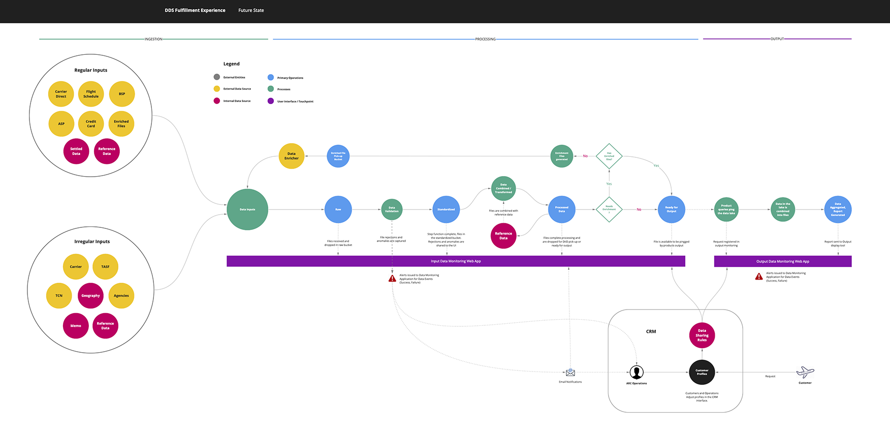
We facilitated stakeholder workshops to map the end-to-end data flow, identify bottlenecks, and align on goals. Partnering with a UX research specialist, we conducted interviews with data engineers and reviewed their daily workflows.
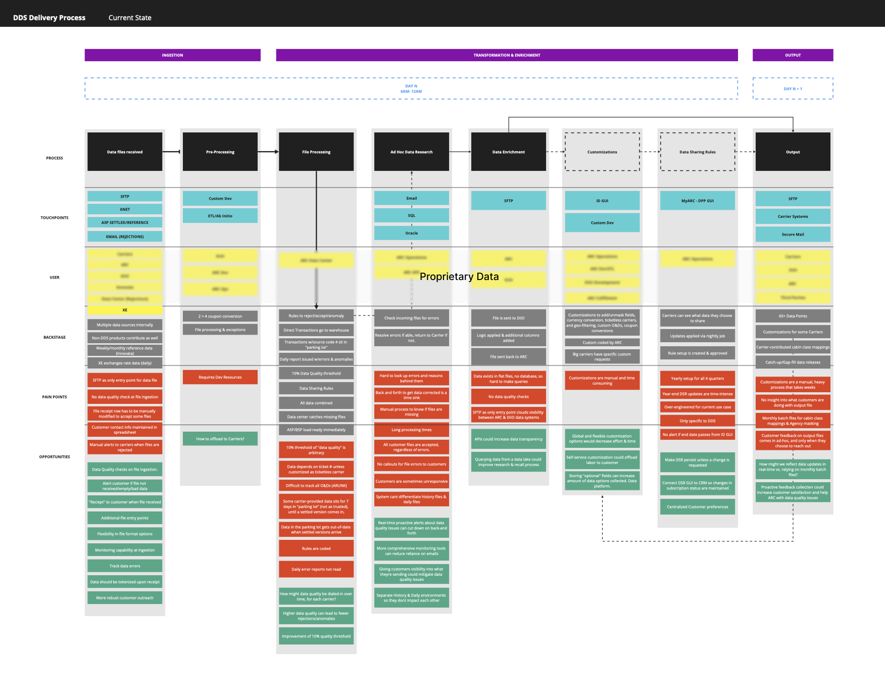
Key Insight
Manually reviewing dat in JSON files, created a slow, error-prone process.
Data sits in an untrusted limbo state if not processed in time for reporting or triage
Data issues were often discovered too late, after reports were produced.
Each provider had unique schedules, making it difficult to fairly monitor performance across time zones.
Delivery
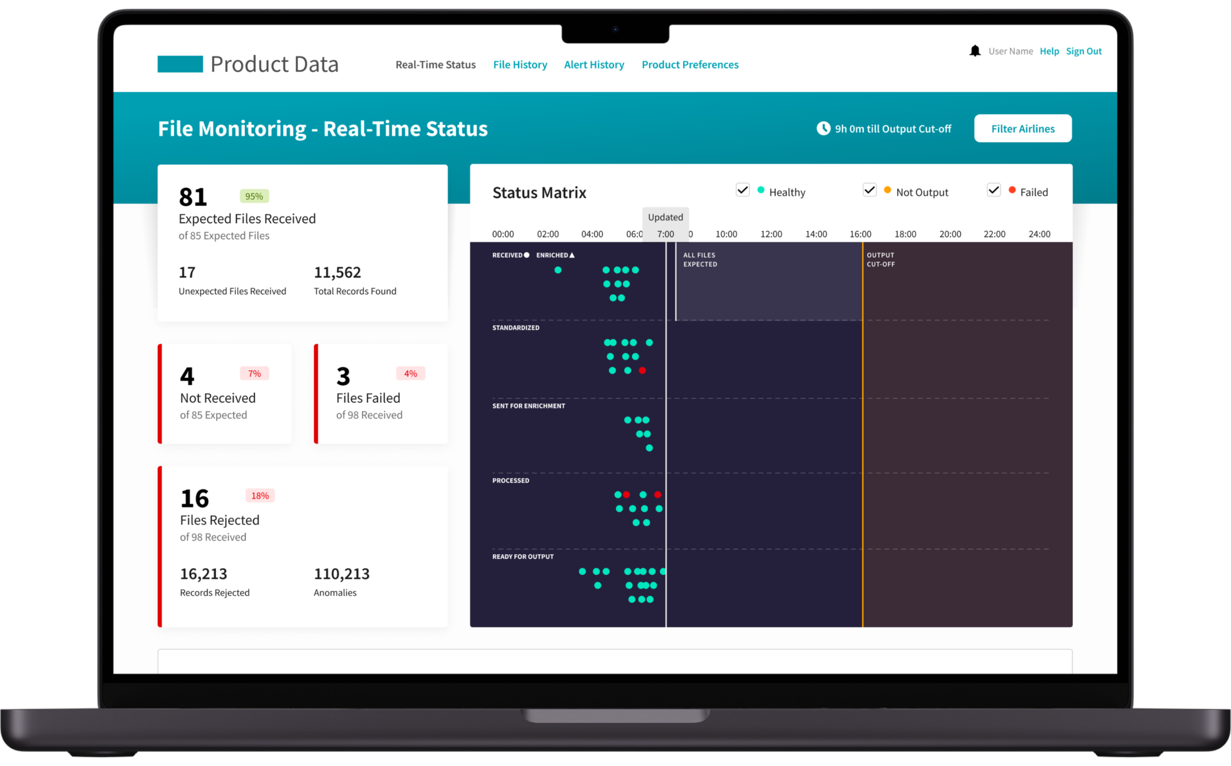
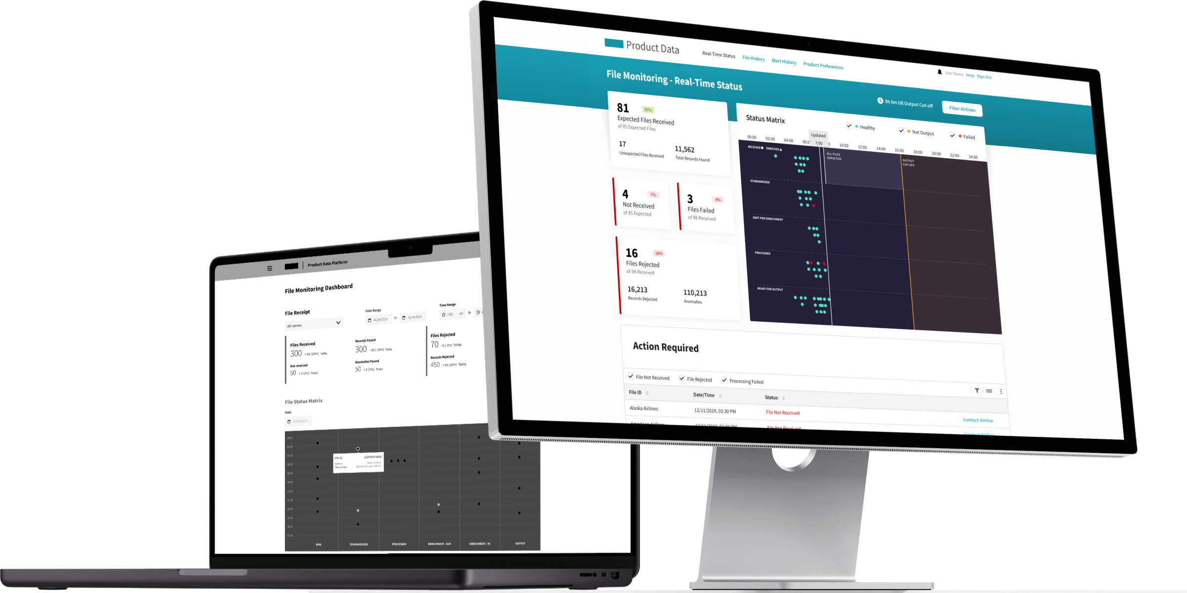
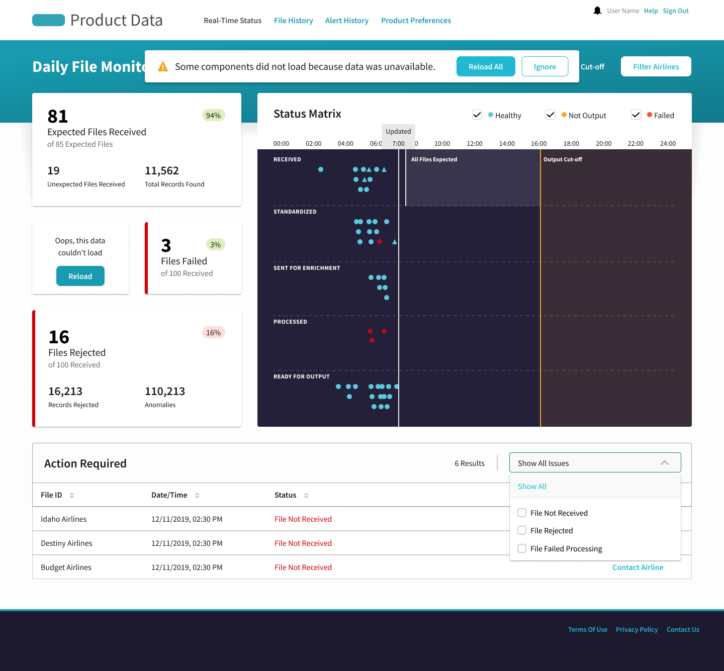
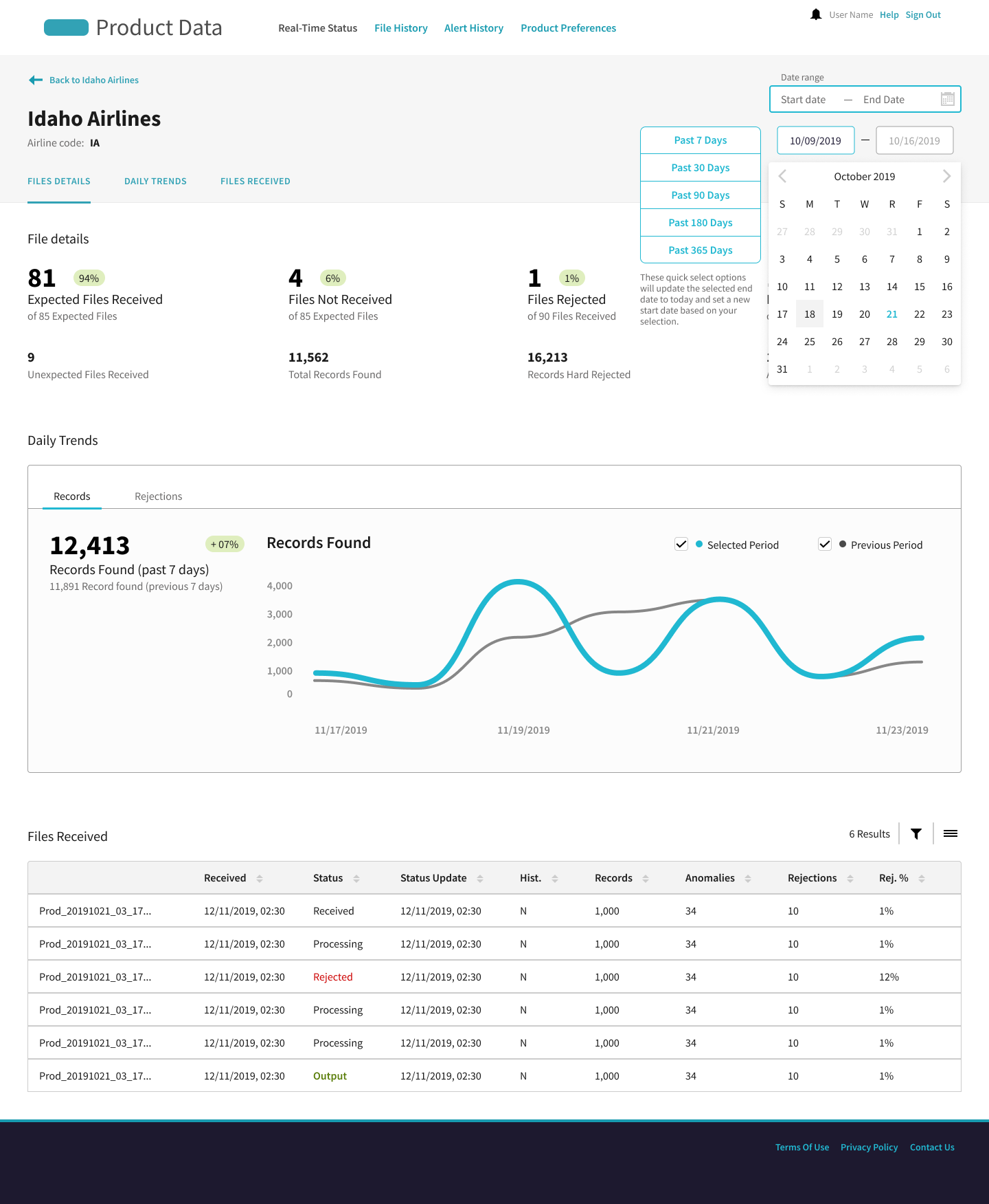
Through several rounds of iteration, the dashboard evolved from a static health visualization into a truly proactive, decision enabling tool. Early prototypes centered on a single graph, but user feedback and real-world data challenges pushed us to focus on actionable elements first. The provider cards became the centerpiece, giving data engineers a clear list of who had missed their deadlines and direct ways to contact them. The visualization was reworked to give a quick, high-level pulse of system health, and proactive notifications ensured no one was caught off-guard before critical reporting cut-offs. Each adjustment brought the solution closer to the team’s real workflow, saving time, reducing missed files by 31%, and restoring confidence in the data pipeline.
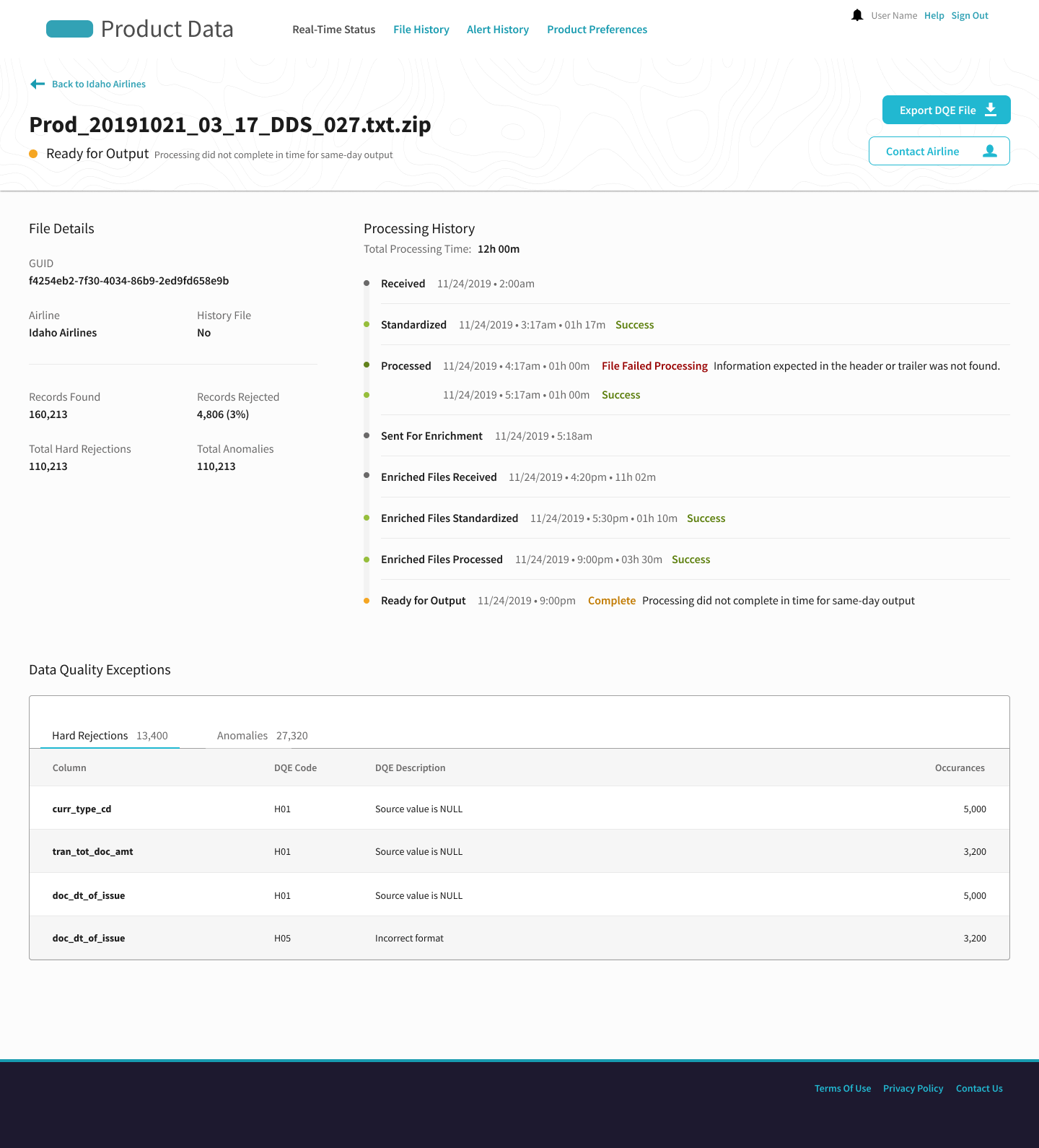
Demo of the dashboard, showing a typical progression of data flowing through the system over the course of a day.
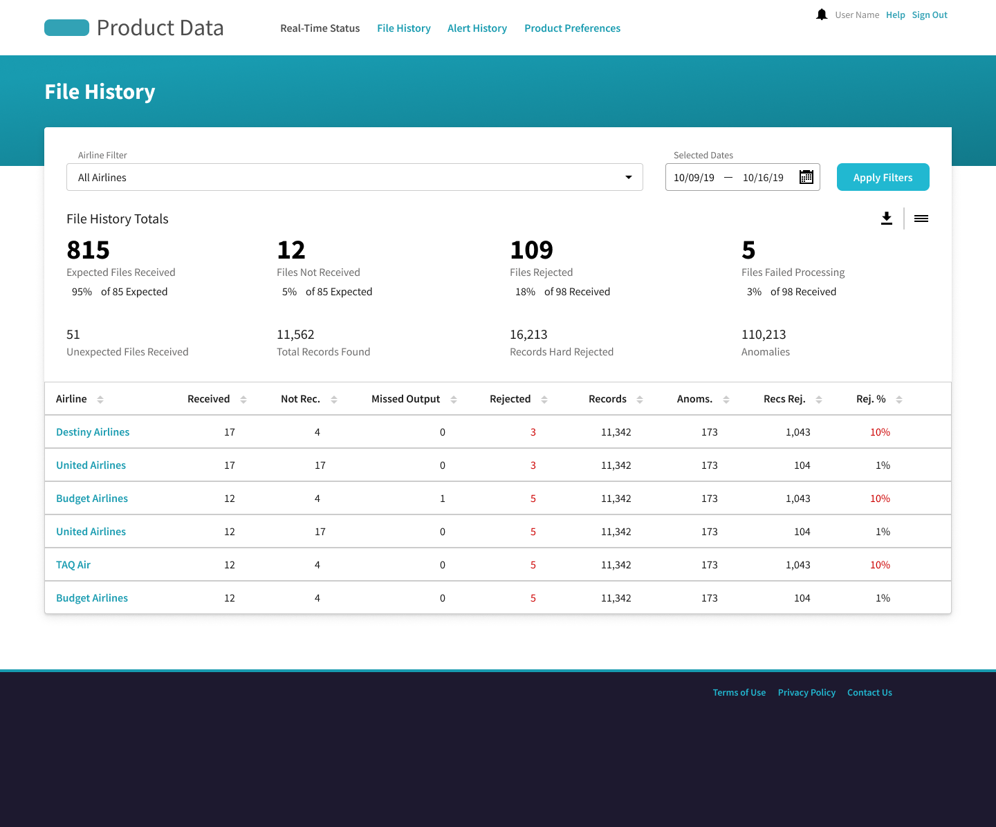
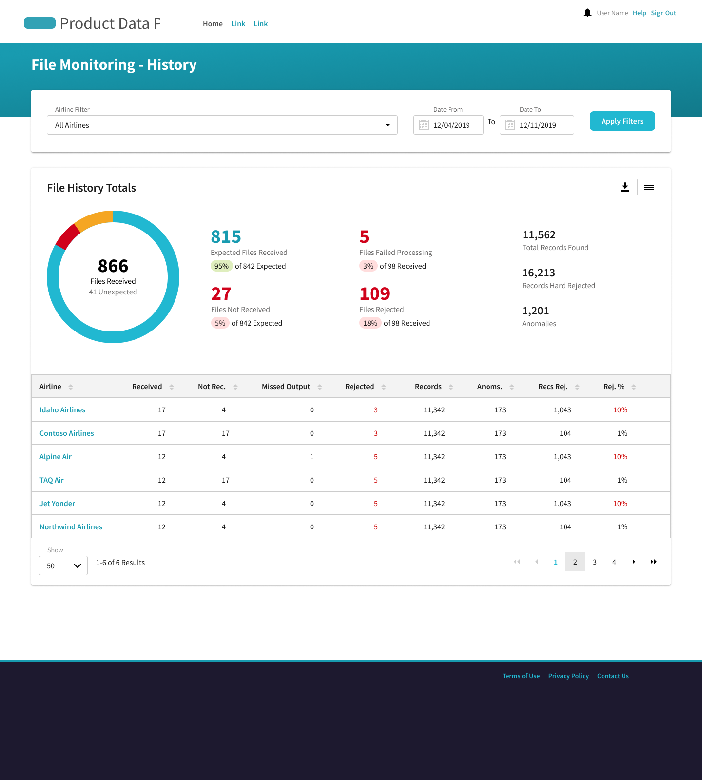
The file history helps the data team find trends and recurring issues of truant data.
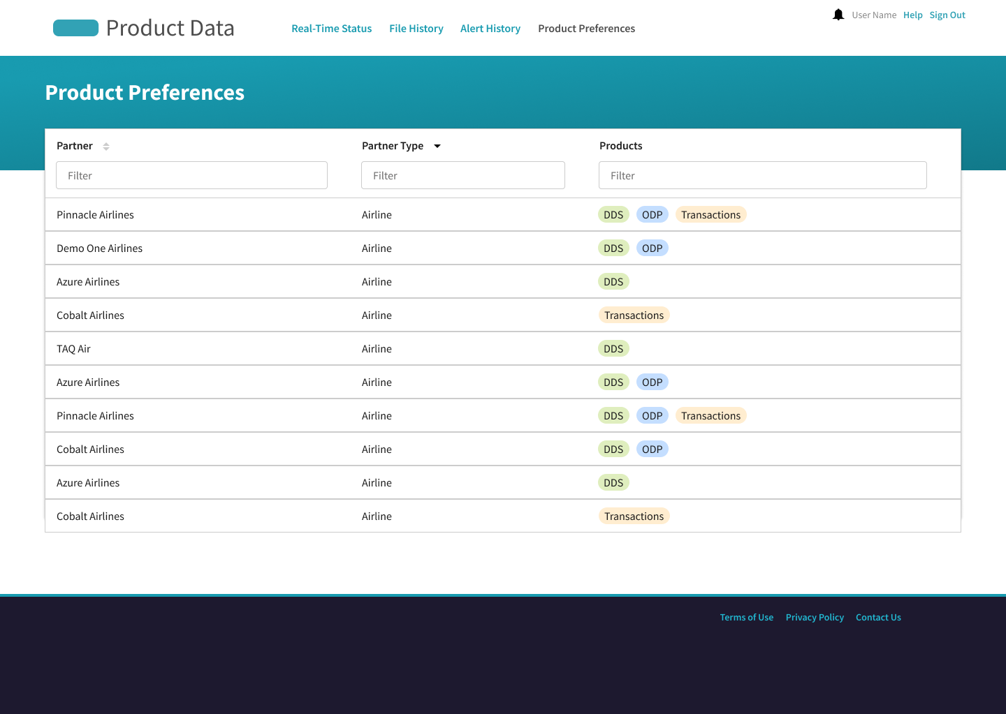
Design System
Throughout the process, I advocated for early adoption of the company’s in-progress design system. We not only applied the existing styles but also contributed new components (below) that are now shared assets for other teams.
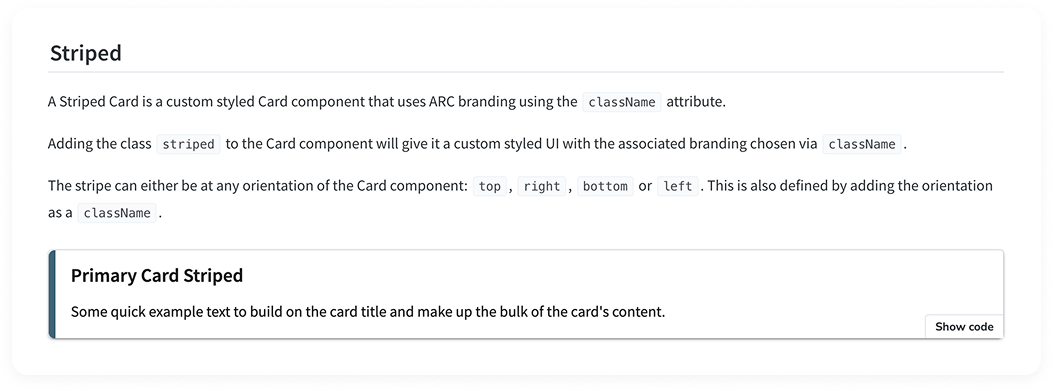
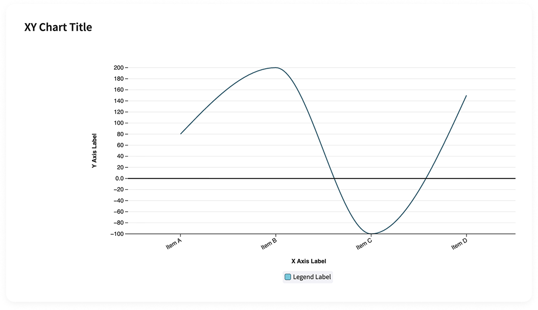
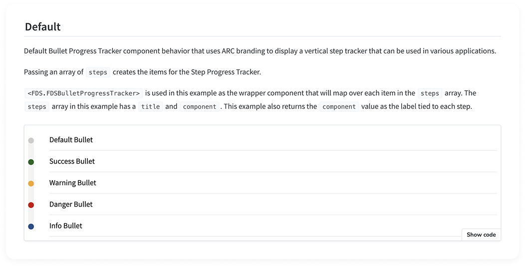
A few examples of components I contributed to the design system.
All testable in StoryBook.
Impact
The big success of the project at large was a huge cost and management savings in moving this workflow to the data lake. However, the data health dashboard in particular led to improvements in reporting and relationships that set the backend up for long term success.
Each iteration of the dashboard brought the team closer to a tool that fit seamlessly into their daily workflow, empowering engineers to prevent issues rather than react to them. The 31% reduction in truant data was a combination of contacting providers to prevent missed uploads and resending broken files. Over time this reduction is projected to improve because of the the knock-on effect of fewer late batches getting resent and a reduction in average batch size. The snowballing effects will serve the client to produce a much higher quality product over which they have much more control.
$2.2 Mil
Savings from the data migration project
-31%
Reduction in truant data over the initial 6 months
-17%
Average batch processing size from fewer late file uploads
Next Steps
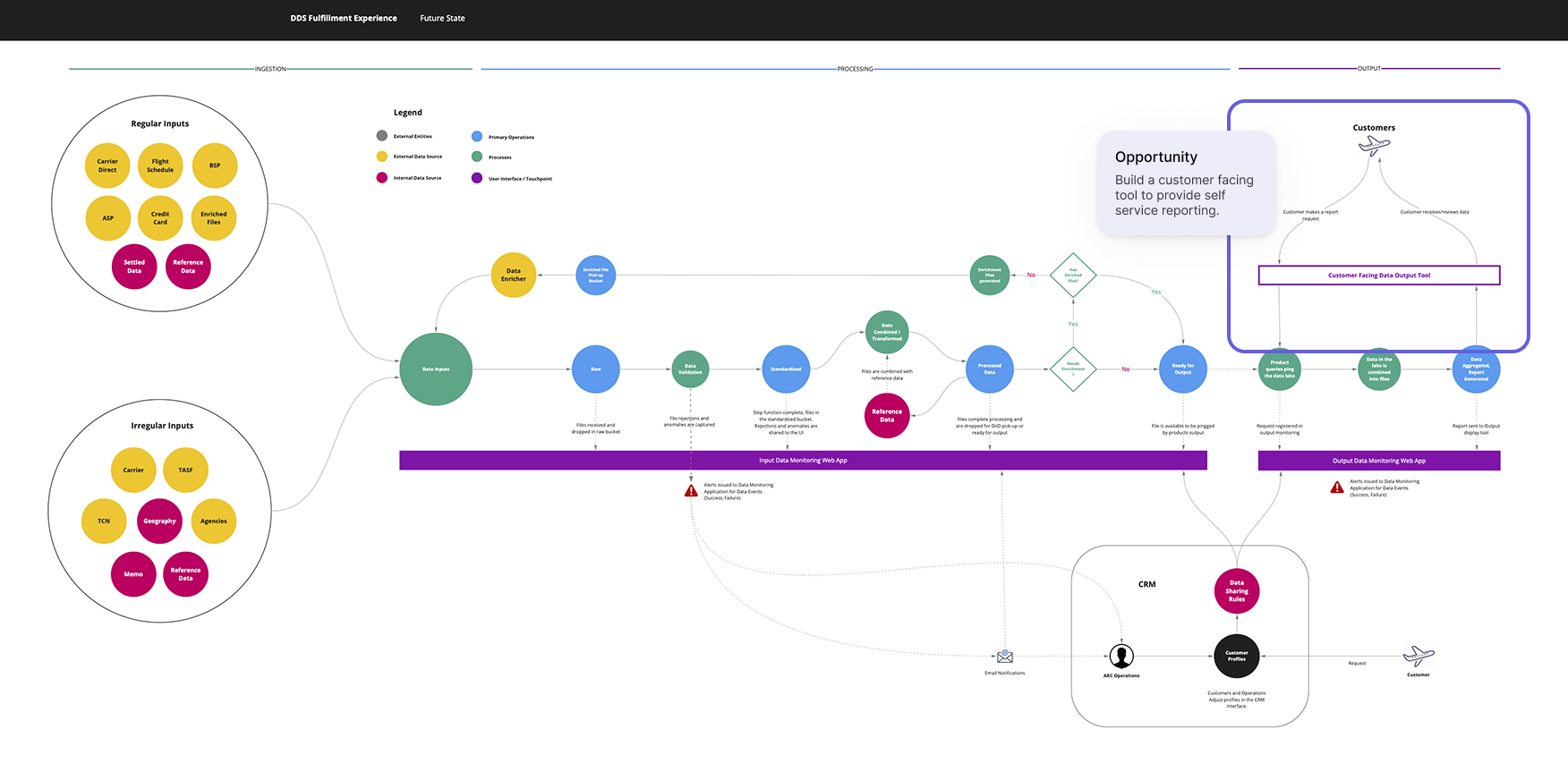
This project demonstrated how thoughtful design can elevate not only the user experience but also the organization’s long-term strategy. The improved data consistency and visibility achieved through this dashboard laid the foundation for a potential new product: self-service reporting. With higher-quality data flowing reliably into the system, the business could now explore offering on-demand insights with confidence. Optimizing the input flow turns a once-frustrating process into a potential new revenue stream.
Reflection
Looking back, I learned how vital it is to design for action first and visualization second. Early versions of the dashboard focused too much on displaying data rather than helping engineers make decisions. Real-world changes in the data pipeline also taught me the importance of testing with live, imperfect data sooner and involving engineers more deeply during early prototyping. If I were to do it again, I’d focus earlier on aligning the dashboard’s structure around the moments when users need to act, not just observe.