SuFo
Visual and Interaction Design
-
Role
Designer
UI and Interaction design
-
Design Challenge
Perform heuristic evaluation of UX wireframes, revise the interaction design and produce high fidelity screens for development
-
Tools
Adobe Illustrator
Adobe Photoshop
Invision
Brief
For this project we worked with Chicago-based startup, Sugarsnap. They have been working for the past few years to create a coordinated system to help doctors more easily access high quality videos that provide Continuing Medical Education (CME) credit. They created a system called SuFo (Surgeon’s Forum) to meet this goal for the web. Currently, many doctors use traditional video sites such as Youtube or Vimeo to view surgical videos but these sites can’t offer CME credit because of the presence of advertising within the content. SuFo’s visions is to curate such videos to maintain a vibrant library that is high in quality, continuously up-to-date, and use a different monetization method to attain CME accreditation.
Content Warning
This case study includes images of surgical procedures that some may find disturbing
Wireframes
Sugarsnap hired a UX team to do research and provide a strategic vision for the site. They provided us with a set of detailed wireframes and research artifacts. Unfortunately, the client was displeased with the overall interaction design of the site. The research had shown a desire for certain features that were not implemented.
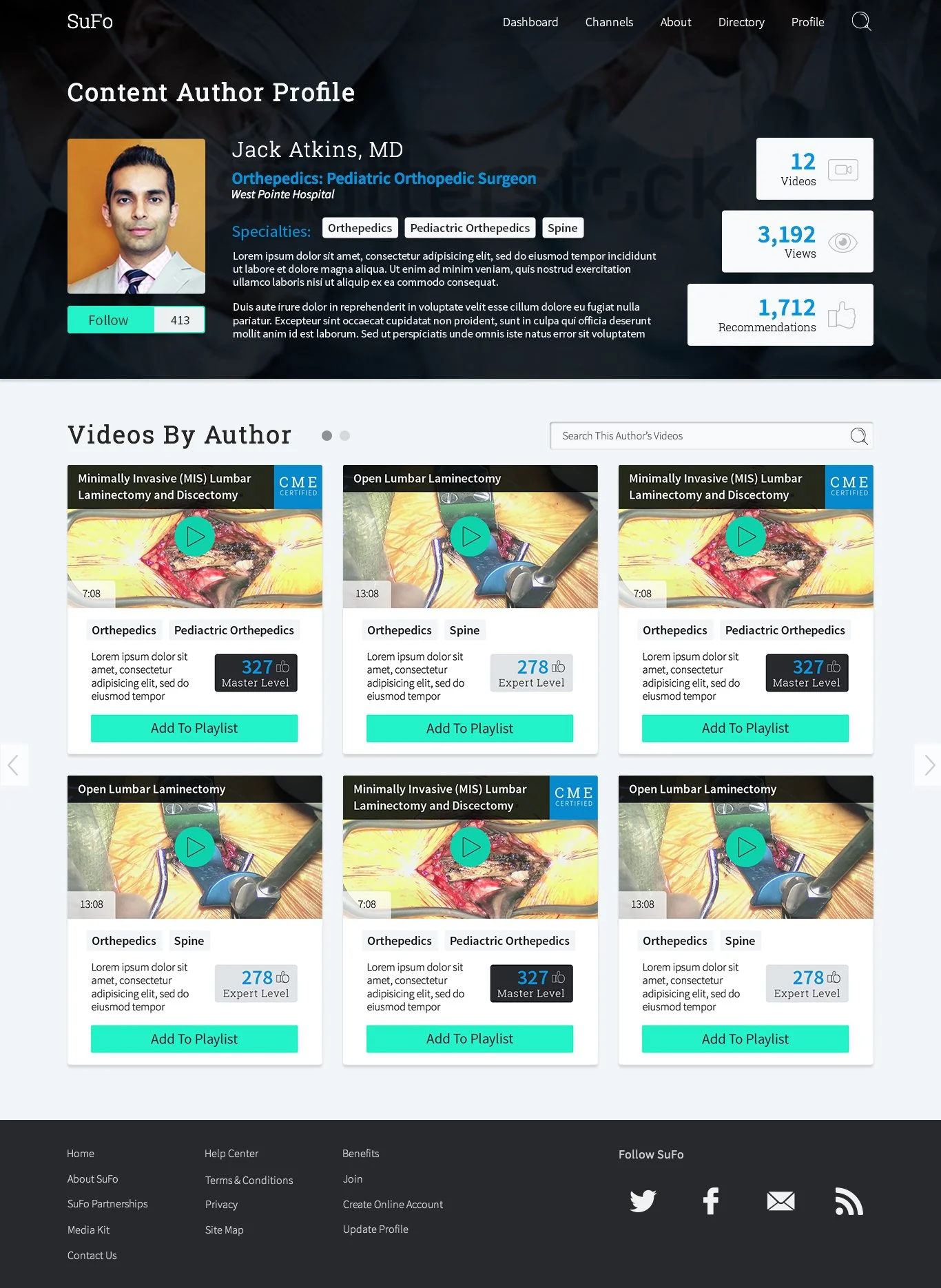
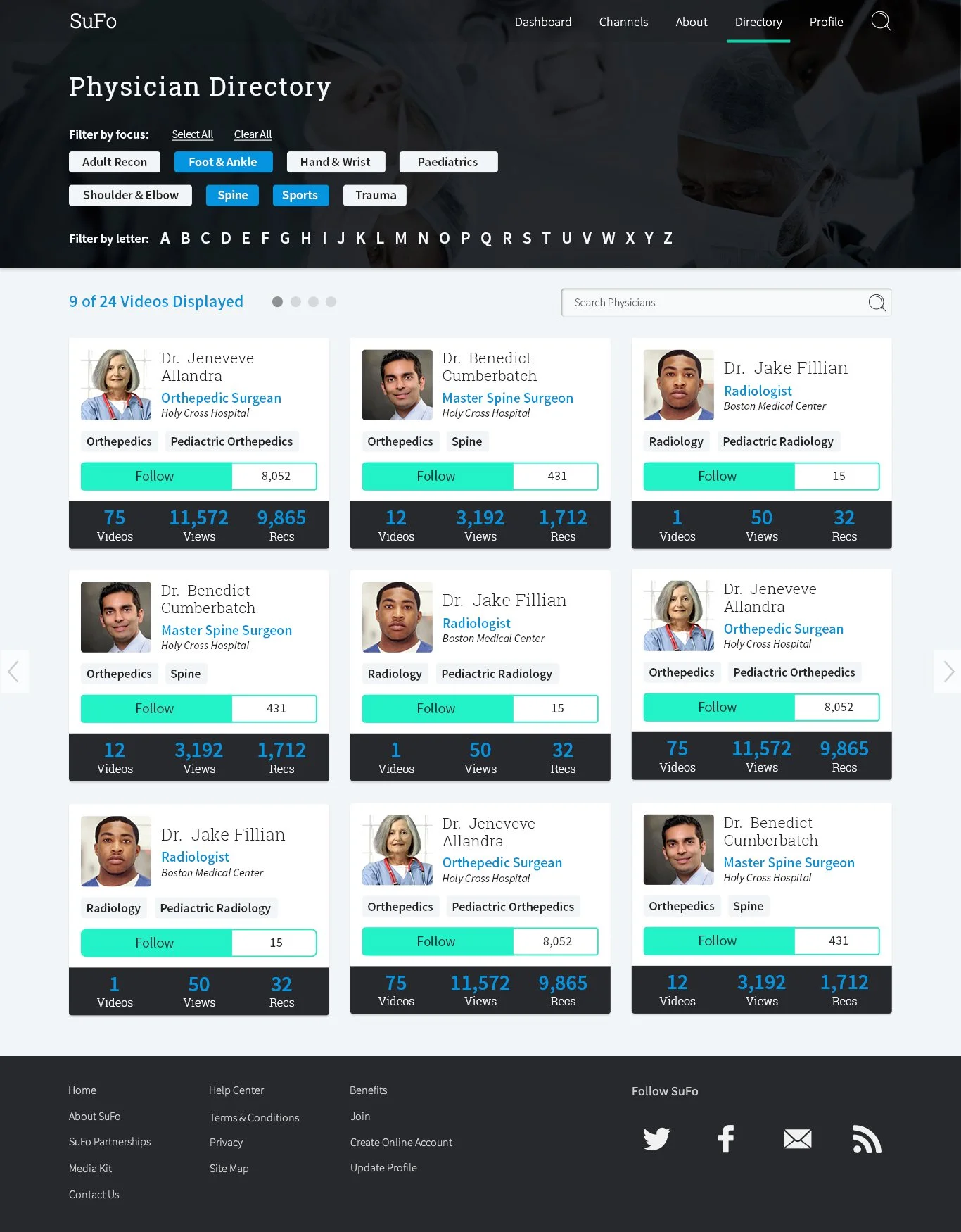
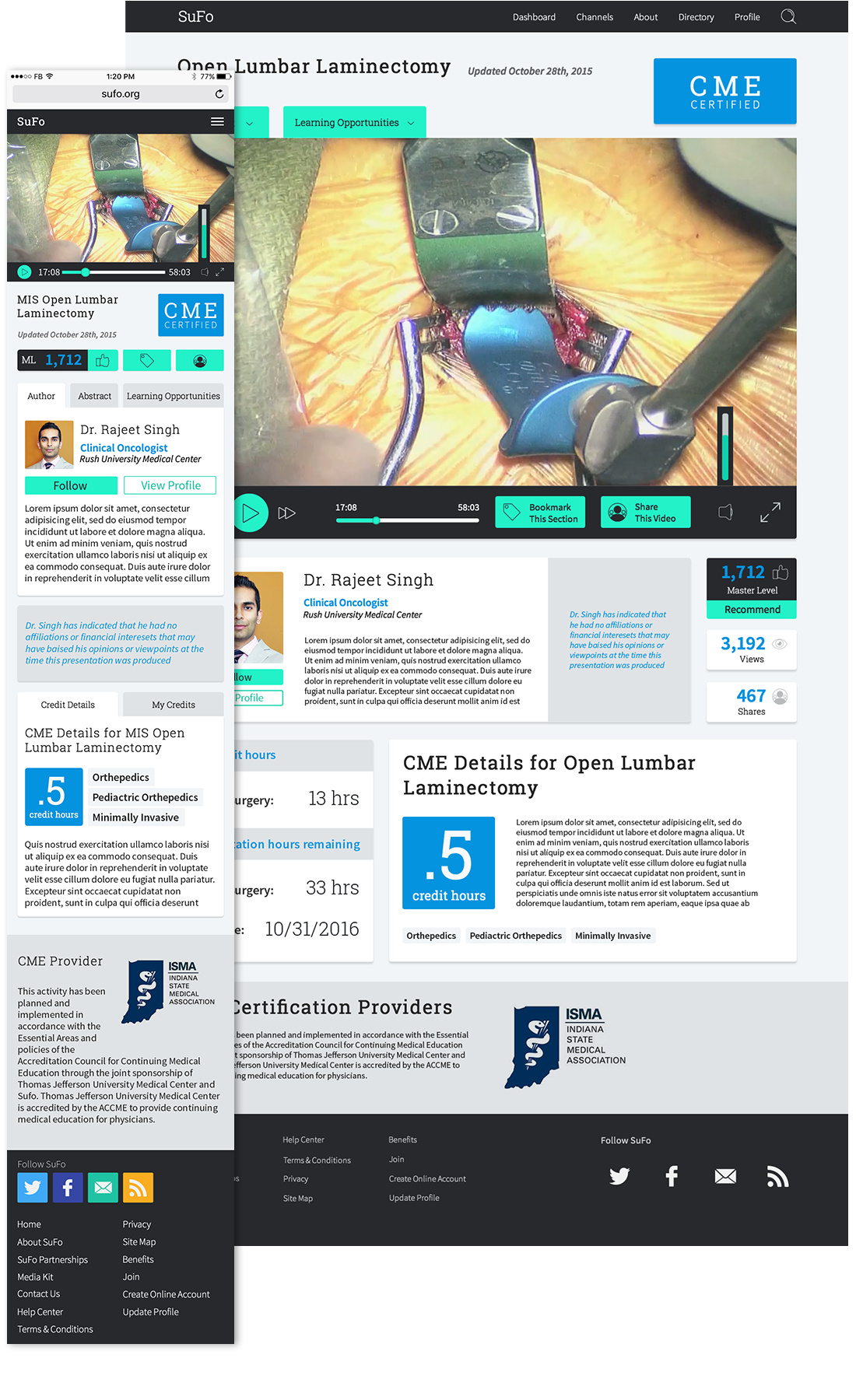
I started by re-evaluating the wireframes and making some key changes. There was a desire to build a more active community by allowing physicians to upload their own videos. This feature was drastically revised from what the wireframes proposed so that there was easier access to uploading, the stats of uploaded videos and the most recent posts. The process of following and recommending was also changed. The wireframes featured expert and master ratings for individual videos. However, the research suggested that the users would want to follow the top doctors so I added monitoring of followers to each doctor. Finally, the client wanted the user to have quicker access to their current credit hours, so we added a hover effect to the navigation so this info would be available on every page.
Style Exploration
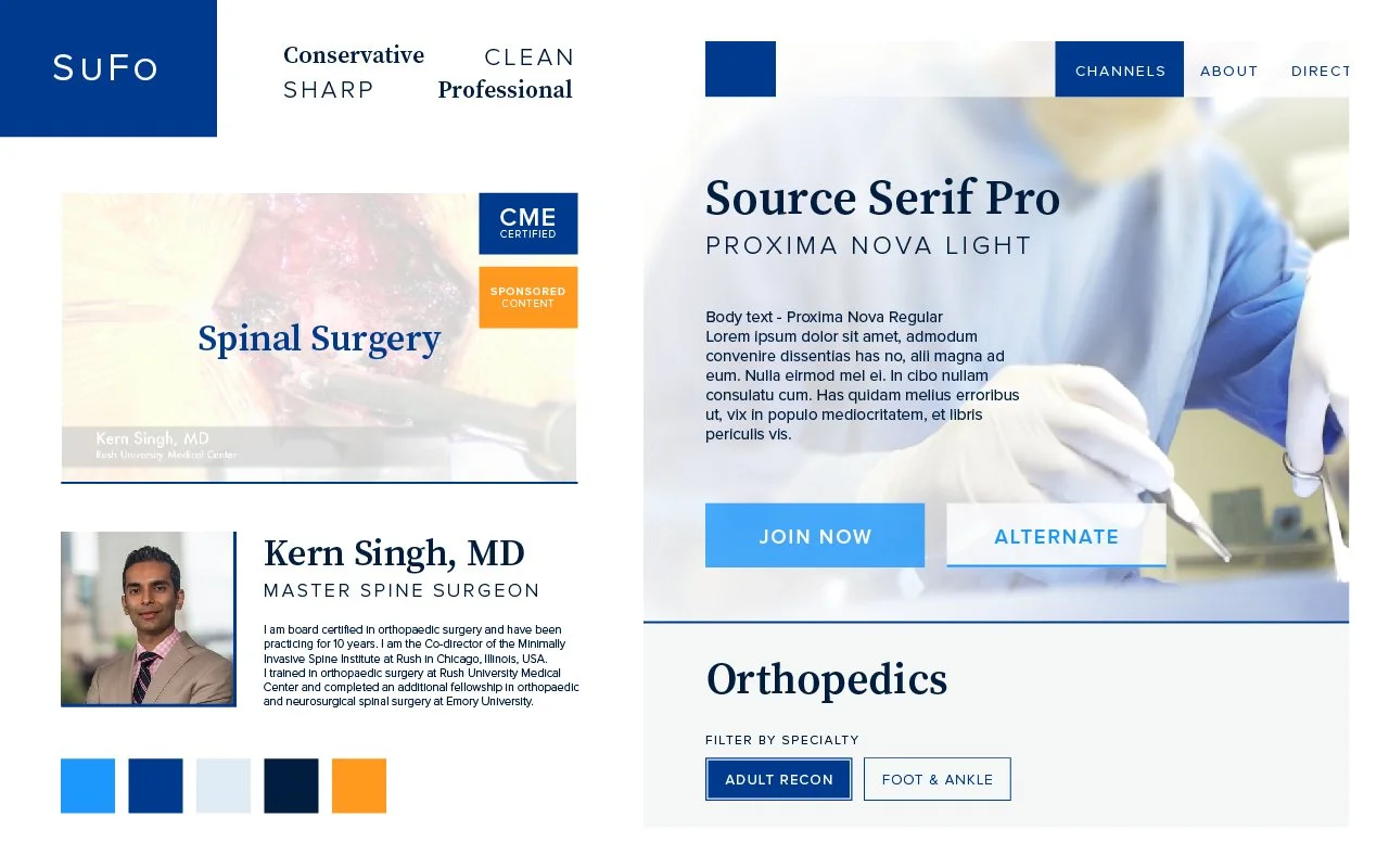
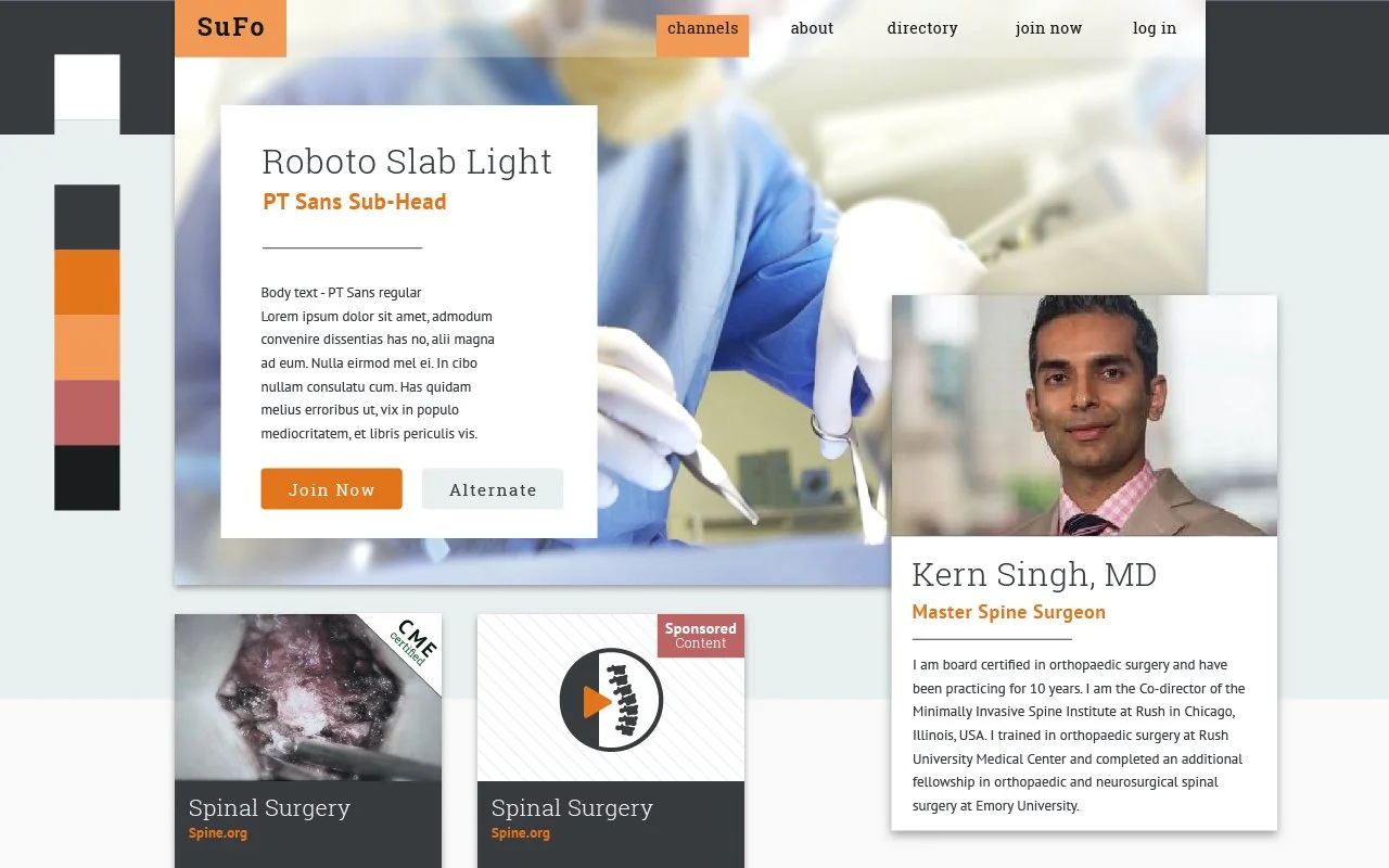
In discussing the visual presentation of SuFo the primary direction we I got from the client feedback was that they wanted to avoid the sterile look of the traditional medical site. They wanted to maintain the professional look that would separate them from general use video sites. However, they wanted to inject a bit of playfulness into the designs as well. While SuFo was a new product, the scope of this project was exclusively to create website artifacts and did not include branding.
I researched a wide range of competitors, highly regarded medical sites and some apps and sites the client favored. From this I was able to generate three main directions to pursue for the design. The client favored the third option, which captured the scholarly feel of professional journals. They liked the clean, professional look but prefered a color scheme that was more in line with the bold and fun exploration. With some additional feedback I generated the high-fidelity mockups below.

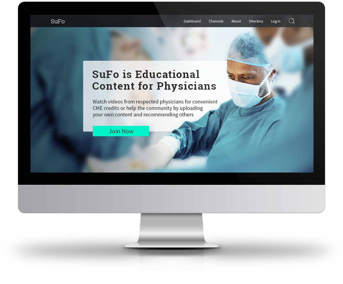
Final UI
Keeping the major concepts from the visual exploration and applying the new color scheme I began to skin the revised wireframes. The addition of the new colors lent itself to a light feel and given the client’s interest in a playful look, I also added slight rounded corner to my ui elements. I also used outlined iconography with minor rounded corners to maintain the balance of being primarily profession with some playful elements.
Mobile
The UX research showed that many doctors are not only watching videos to attain CME credits, but also as a refresher for upcoming surgeries. Because this is often done on phones, the UX team provided wireframes for a mobile app as well. Unfortunately, this didn’t fit into the initial launch budget for SuFo so I generated mobile breakpoints for the screens. I also built the site from the ground up using a bootstrap grid system to expedite development.

Learning and Growth
My initial push on this project was to make more custom content than developers could support. I learned a lot about how to account for proper grid structures and reusable components. Because the primary users in this case would be on desktop, we prioritized those views but if I could revisit the project I would do it mobile first.