Totem
Research and UX Design
-
Role
Designer
Research and Experience Design
-
Design Challenge
Identify innovative new solutions to prepare high school students for academic success in college by improving critical soft skills.
-
Tools
Axure
Proto.io
Adobe After Effects
Brief
The prompt, a mock version of a prompt from the Bill and Melinda Gates Foundation, dictated that we disrupt the high school education system with innovative technology to better prepare graduates for college. As the user experience architect I took the project from this exploratory prompt to the creation of high fidelity wireframes and a mobile prototype ready for user testing. Totem, a task management app for mobile devices, was born from research showing that students in the first year of college often suffer because they never learned key organization and time management skills during high school.
Research
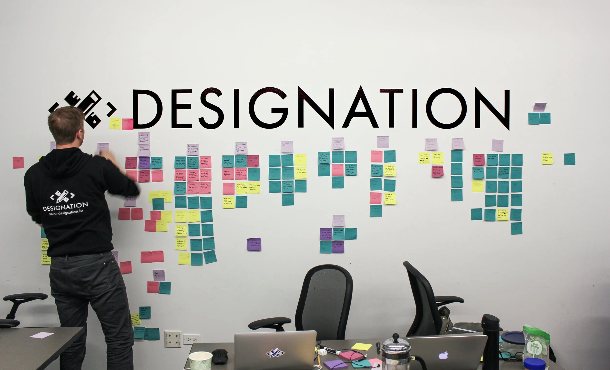
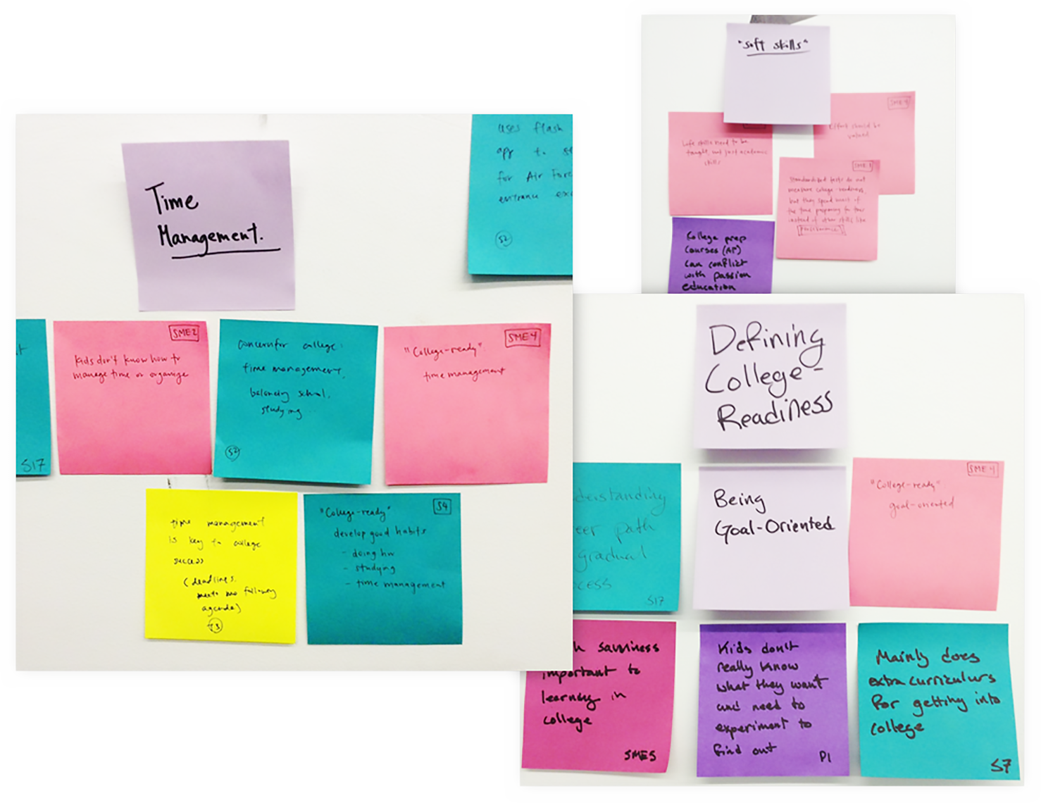
As a three person team, two UX architects and one UI designer, we approached the prompt as a two-stage design sprint. By using a combination of market research, academic papers and interviews with subject matter expert, we discovered that the primary issue we could solve was that soft skills - time-management, scheduling and goal-setting - are not being taught in high school. Focusing on this subject, we set about learning how our users were currently navigating these issues and what tools they were using. By ideating around this research, we decided to pursue a solution that took the best elements of current task managers and focus these elements on the specific needs of students.
We also established two main personas for whom we would design our product. Our primary persona was Deion, an average student not achieving all of his academic goals directly because of his lack of soft skills. Deion needs help to organize his schedule so that he is doing some school work every day and doesn’t miss simple assignments or forget test prep. The other is Eleanor, a self-directed student who excels almost to a fault. She needs a product to help her balance busy academic and extracurricular goals, as well as chunk her big assignments into smaller tasks.
Initial Exploration
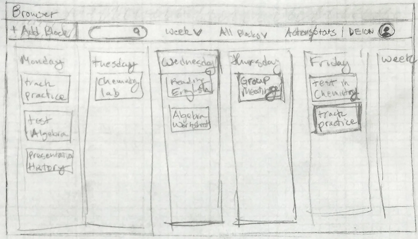
Once we decided upon our solution, we began to ideate through divergent concepts, build out two prototypes and validate our concepts. I designed a chromebook-optimized website that focused on spreading out a complex schedule. My goal was to show students how they could improve their schedules and create more free time by setting personal due dates. I used design patterns from successful task managers such as Trello and refocus them toward the specific challenges of high school. The key feature was that assignments would be pushed to students, thus removing the tedious task of setting the initial schedule, and allowing students to focus on making the changes that help them most.

We took our concepts to a suburban high school west of Chicago. We ran eight students, ages 14-16, through task-based usability tests. All of the students heavily preferred the mobile platform because it felt more comfortable to them. We also learned that our vocabulary was way off the students expectations. Terms like soft due dates, projects vs. tasks, blocks and chunking, didn’t resonate with the students.
Moving to Mobile
Based on the response from the students it was clear we needed to design for mobile. We also re-examined our users to make sure the entire experience was using the student’s voice. At this point we decided to coin the name Totem for our product. The name represents the permanence and personal quality of our product. The term totem also evokes the notion of guidance that we planned to embody.
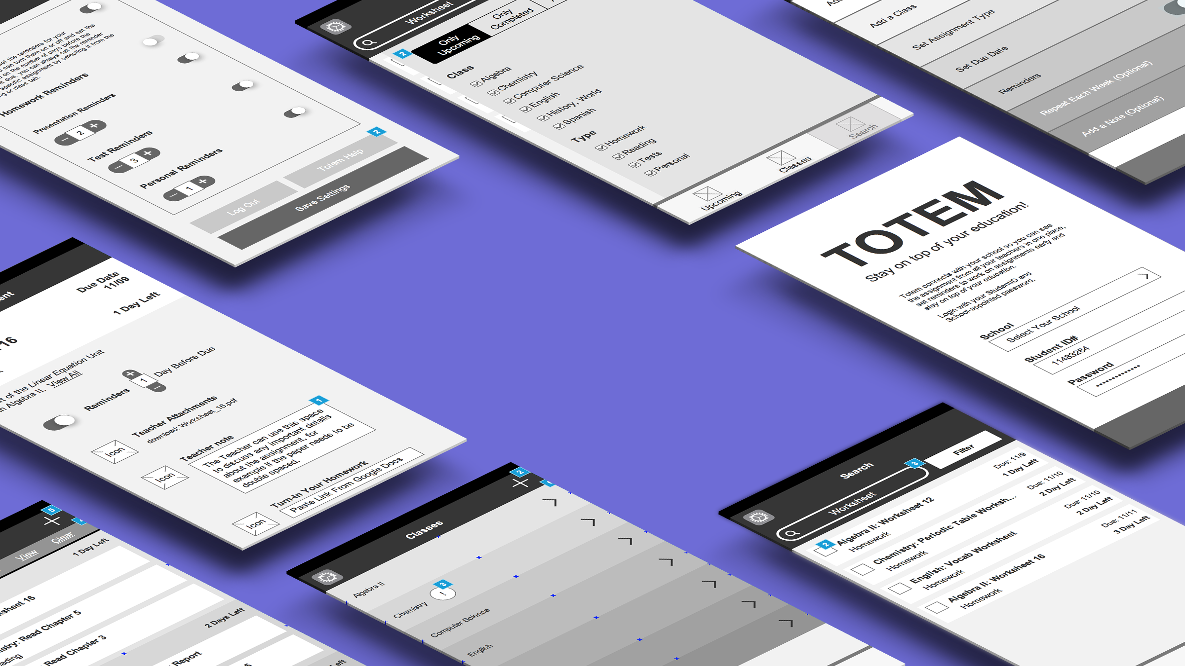
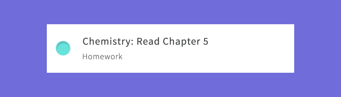
I designed the revised mobile app for students to be easy, glanceable and delightful. The new app kept much of the assignment pushing and school integration that students appreciated, but reformatted it as a simple to-do list. This allowed the students to see the most important task more easily and clarified the language. I also wanted students to build a relationship with completing tasks so I designed fun animations for when students check off items from their lists. Finally, the idea of setting personal due dates didn’t resonate with the students, so we replaced this idea with reminders, represented as notifications.


Animation
The feedback we received on the final design was incredibly positive. Our final round of user testing showed that the product was easy to use, with students able to complete most tasks without a tutorial. The primary complaint about the new design was that checking off tasks was too subtle. To solve this, I used After Effects to build out five, of the planned twenty, animations for checking off boxes. This added the flourish that testers wanted to confirm their action and the fun factor to delight the users. Fellow designers noted the Learning Management System (LMS) integration, in-app assignment submissions, and the delight factor as key differentiators from the endless sea of task management apps on the market.
Learning and Growth
My goals on a long enough timeline would have included additional features such as assignment submissions using the camera, additional customization features for power users and coverage across a greater number of devices. Despite being a mock project, our team believes that the research and insights from this project could, one day, be used to bolster commercial projects that improve students’ lives.