Jibo App
An invite to the future, sent to the whole family
> UX Design
> Native Mobile Design
> Service Blueprinting
> Illustration
Skills Focus


01 —
Situation
Jibo, the worlds first social robot, is a friendly helper in your home. Jibo is meant to be smart and fun, not a bureaucrat. To be helpful he needs to access you wifi, managing long lists of friends, and connect to external application like social media. This is where the Jibo app comes into play. While not quite as flashy as the robot itself, the app needs to have charm and personality while covering many mundane tasks Jibo needs as support.
Add Me To Your Loop!
< < <
Add Me To Your Loop! < < <
— 02 —
Approach
The app had to allow whole families to interact safely and securely with their new robot housemate. We identified early that this meant onboarding of children under the age of 13, which in the US means adhering to strict guidelines of C.O.P.P.A., the Childrens Online Privacy Protection Act. I worked closely with the InfoSec and DevOps teams to design a tight but secure onboarding experience. Designing the app around this constraint made for occasionally compromises to the flow. But the result was that Jibo could interact safely and personally with his smallest friends.
— 03
Result
The release of Jibo and our native mobile app resulted in an overwhelmingly positive user experience for early adopters. Launched onto both iOS and Android platforms, it has garnered over fifty 5-star reviews on Google Play. This remarkable user feedback underscores the app's success in integrating Jibo into family life, including younger audiences.
Information Architecture
Initial organization of the product was cluttered and expansive. To be most effective, the needed to allow users quick access to setup and utility elements. Ultimately many of the original features of the mobile experience were pushed to the robot. What remained was laid out in a flat structure with key set up tasks triggered automatically during onboarding.
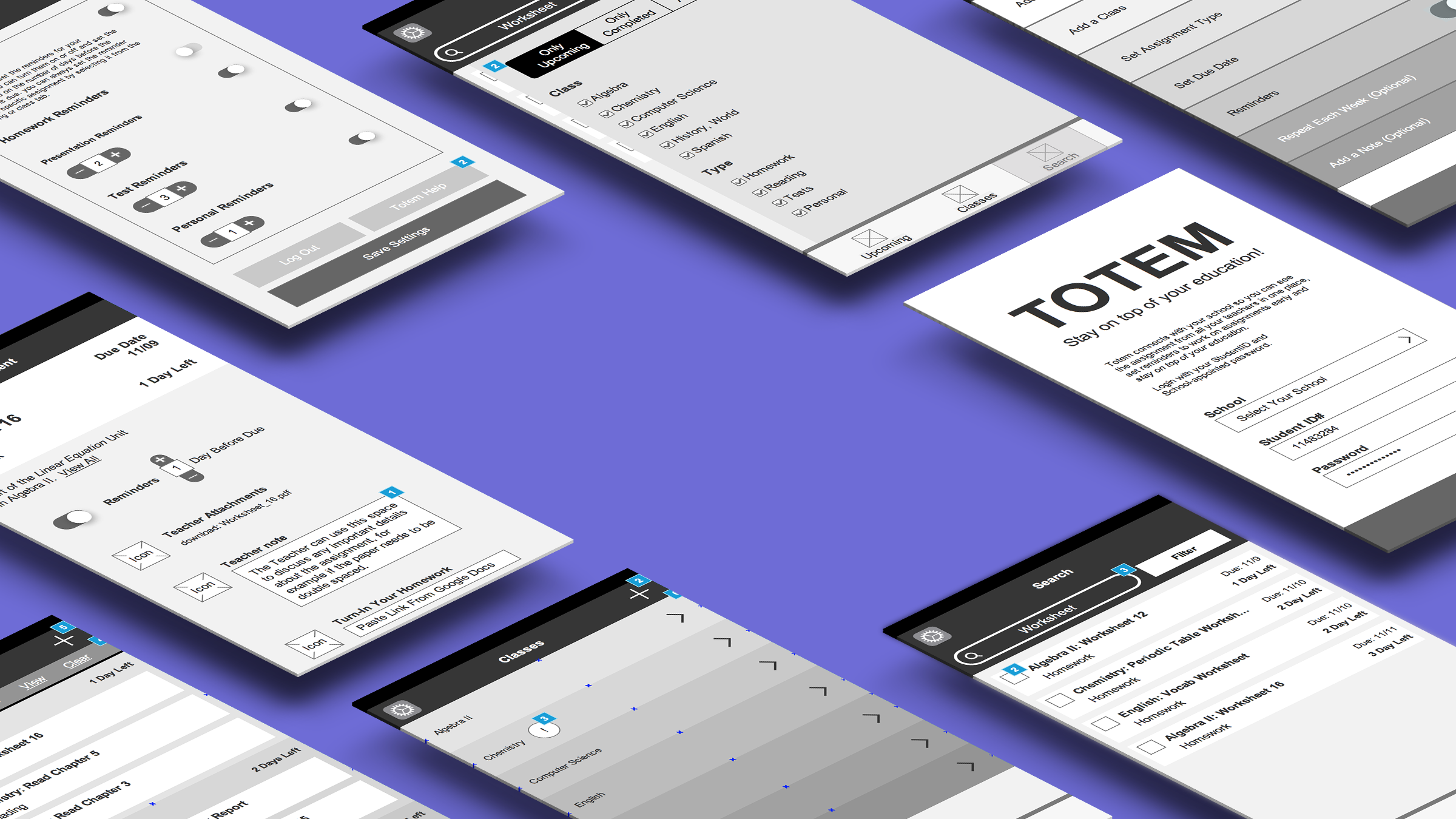
Early Design
I joined the team as the first mobile specific designer and we decided early on to develop native on both iOS and Android. We learned early in the prototype phase that we weren’t going to learn enough from user testing without connecting to the robot hardware. This led to the decision to stand up a working prototype as quickly as possible. To manage the scope we opted to lead with iOS/Swift development, following the HIG closely, for our initial prototype. Early designs focused on getting the content into the app and making sure users had all the necessary controls to interact with the robot. By quickly standing up a usable prototype we were able to test the most important functions of the app, connecting Jibo to WiFi and adding family members to Jibo’s memory.
Testing led to many key learnings that dictated the final design. Most importantly, we learned that setting up the robot was even slower than expected. Children are often involved and don’t understand the mechanics involved. They just shout at Jibo and wonder why he isn’t responding. This motivated us to find ways to both collapse the process wherever possible, but also to find things the user could do during setup to distract them. We knew this prototype wasn’t going to be as fun as the robot or even where we wanted the app visuals to go. But this wasn’t just perception, the differences caused confusion. Users weren’t sure if the different icons, emojis, and animations on the robot represented the same elements they do on mobile. Creating parity between the two applications was going to be key in building a cohesive and clear experience.
Final UI
My primary goal with the final visual design was to find ways to connect the app with the robot. Despite the utility focus, I found ways to incorporate illustrations and micro-interactions to make the app feel like it belonged in the same family. As the app evolved we moved away from basic HIG and Material design standards in order to make the branding stronger and more similar between platforms without alienating users. The final design also made room for more fun features like customizing your robot and teaching fun prompts to get users started. Any features that wouldn’t work on robot, either because of views or voice accessibility, needed to be on the phone but still match the joy and motion characteristic of Jibo’s personality.
Credit to Heather Mendonça and Danielle Faugno-Teig for many illustrations within the design.


Learning and Growth
Looking back at this project the clear issue with these designs was accessibility. The cyan/white combination is not readable and generally font sizes are a struggle. We put a large emphasis on continuing to use robot fonts, but platform fonts would likely have been a better experience.